Chapter 3 Visualization
Visualizing proteomic data helps identify patterns, outliers, and biological signals. This chapter covers the main visualization methods in NULISAseqR.
3.1 Why Visualize?
Data visualization helps you:
- Identify sample clusters and outliers
- Assess data quality visually
- Detect batch effects
- Explore biological patterns
- Communicate findings effectively
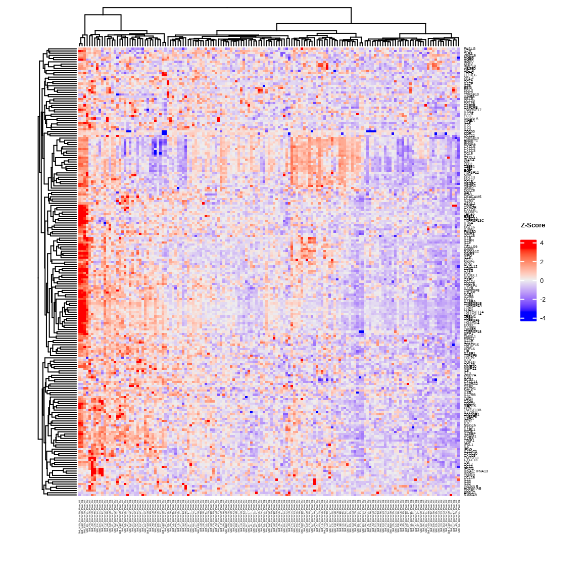
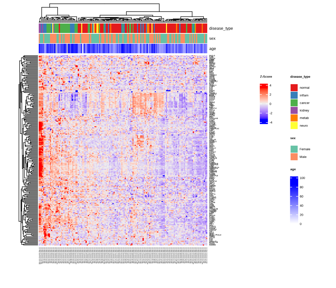
3.2 Heatmaps
Heatmaps show protein expression patterns across samples with hierarchical clustering.
The generate_heatmap() function:
- Scales data by protein (z-scores): centers and standardizes each protein’s values
- Clusters similar samples and proteins together
- Annotates samples with metadata (disease type, sex, age, etc.)
- Uses
ComplexHeatmapwith automaticRColorBrewercolor palettes
See complete function documentation and additional options, use ?generate_heatmap().
3.2.1 Basic Heatmap
heatmap1 <- generate_heatmap(
  data = data$merged$Data_NPQ,
  sampleInfo = metadata,
  sampleName_var = "SampleName",
  sample_subset = sample_list,
  row_fontsize = 5
)
3.2.2 Heatmap with Annotations
Add sample annotations to highlight key variables:
heatmap2 <- generate_heatmap(
  data = data$merged$Data_NPQ,
  plot_title = "NULISAseq Detectability Study Heatmap",
  sampleInfo = metadata,
  sampleName_var = "SampleName",
  sample_subset = sample_list,
  annotate_sample_by = c("disease_type", "sex", "age"),
  row_fontsize = 5
)
3.3 Principal Component Analysis (PCA)
PCA reduces high-dimensional data to its main components of variation.
The generate_pca() function:
- Scales data by protein (z-scores): centers and standardizes each protein’s values
- Performs PCA using
PCAtoolsto identify major sources of variation - Creates biplot showing sample relationships in PC space
- Annotates samples with metadata colors and shapes
- Uses automatic
RColorBrewercolor palettes or custom colors
See complete function documentation and additional options, use ?generate_pca().
3.3.1 PCA with Multiple Visual Encodings
Color by one variable, shape by another:
pca2 <- generate_pca(
  data = data$merged$Data_NPQ,
  plot_title = "NULISAseq Detectability Study PCA",
  sampleInfo = metadata,
  sampleName_var = "SampleName",
  sample_subset = sample_list,
  annotate_sample_by = "disease_type",  # Color
  shape_by = "sex"                       # Shape
)
3.3.2 Understanding PCA Plots
Axes
- PC1 (x-axis): Captures the most variation in the data
- PC2 (y-axis): Captures the second most variation
- % variance: Shows how much variation each PC explains
Interpretation
- Tight clusters: Samples with similar expression profiles
- Separation: Groups with distinct expression patterns
- Outliers: Samples far from the main cluster
- Batch effects: If clustering by technical variables (plate, batch), indicates unwanted variation
What to Look For
Good signs:
- ✓ Samples cluster by biological group
- ✓ PC1/PC2 explain substantial variance (>20% combined)
- ✓ Clear separation between conditions
Warning signs:
- ✗ Clustering by technical variables (batch, plate)
- ✗ Outliers far from their group
- ✗ No visible separation despite known biology
3.4 Custom Visualizations with ggplot2
For exploratory analysis beyond heatmaps and PCA, create custom plots with ggplot2.
# setting ggplot theme
# custom ggplot theme

custom_theme <- theme_bw() + theme(
  panel.background = element_rect(fill='white'),
  plot.background = element_rect(fill='transparent', color = NA),
  legend.background = element_rect(fill='transparent'),
  legend.key = element_rect(fill = "transparent", color = NA)
)

theme_set(custom_theme)

showtext::showtext_auto() ## able to output beta symbol and other special character in pdf
3.4.1 NPQ Distribution - Histogram
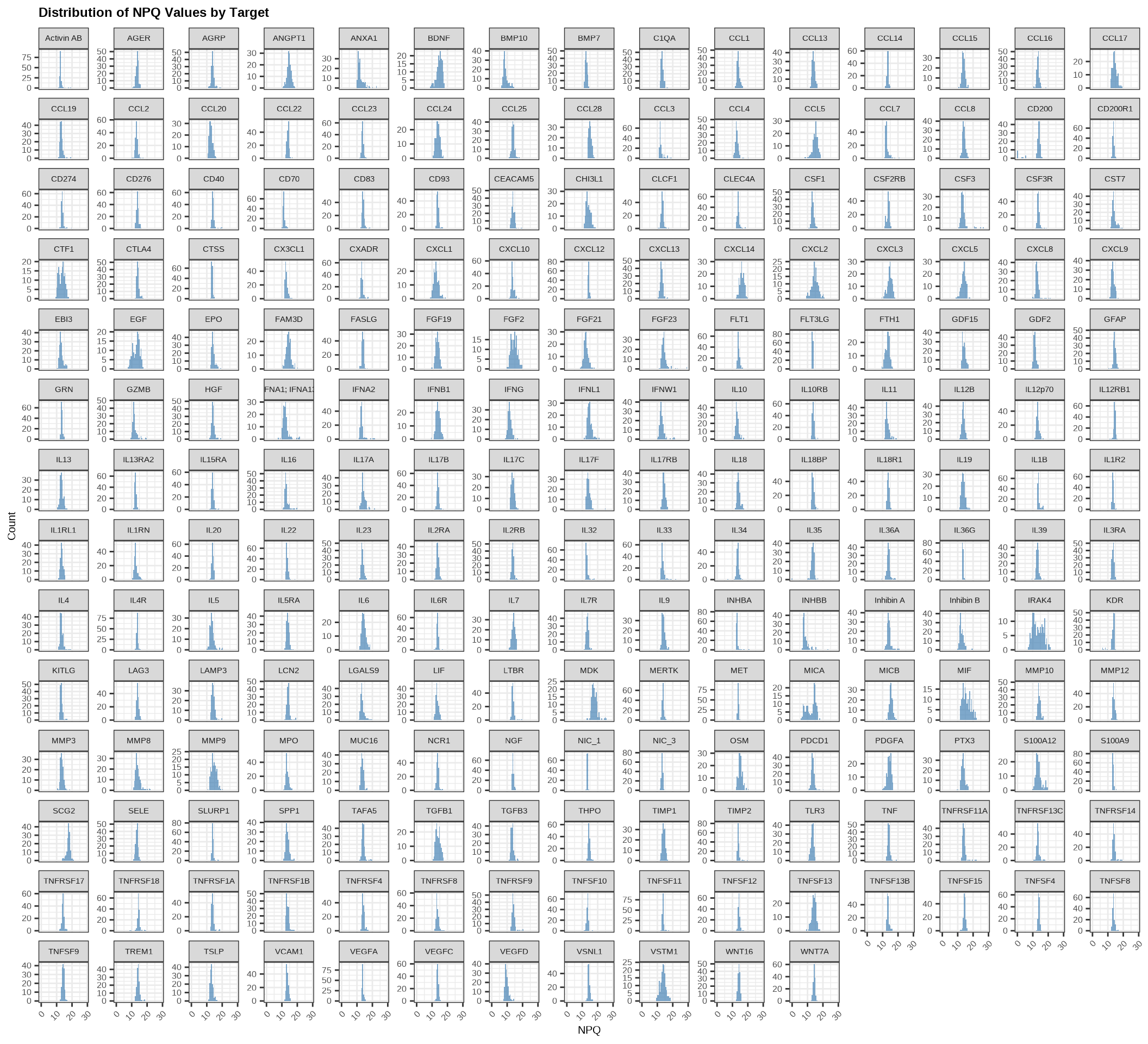
Check the overall distribution of NPQ values across all samples and proteins:
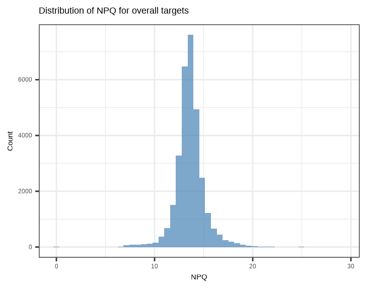
Check the distribution of NPQ values across all samples for each protein:
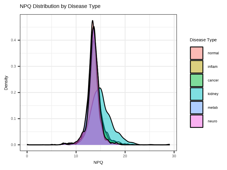
3.4.2 NPQ Distribution by Group - Density Plot
Compare NPQ distributions between groups to check for systematic differences:
3.4.3 Single Protein Across Groups
Examine how a single protein varies across conditions:
# Plot a specific protein across groups
protein_of_interest <- "IL6"

data_long %>%
  filter(Target == protein_of_interest, SampleName %in% sample_list) %>%
  ggplot(aes(x = disease_type, y = NPQ, fill = disease_type)) +
  geom_jitter(width = 0.2, alpha = 0.7, size = 1) +
  geom_boxplot(alpha = 0.3, outlier.shape = NA) +
  labs(title = paste(protein_of_interest, "Expression"),
       x = "Disease Type", y = "NPQ") +
  theme(legend.position = "none")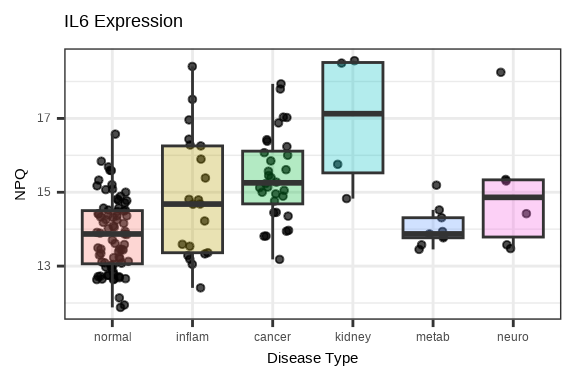
3.4.4 Multiple Proteins Across Groups
Compare several proteins simultaneously using facets:
# Select top 6 proteins by variance
protein_variance <- apply(data$merged$Data_NPQ[, sample_list], 1, var, na.rm = TRUE)
top_proteins <- names(sort(protein_variance, decreasing = TRUE)[1:6])

# Plot multiple proteins
data_long %>%
  filter(Target %in% top_proteins, SampleName %in% sample_list) %>%
  ggplot(aes(x = disease_type, y = NPQ, fill = disease_type)) +
  geom_boxplot(alpha = 0.7, outlier.shape = NA) +
  geom_jitter(width = 0.2, alpha = 0.3, size = 1) +
  facet_wrap(~Target, scales = "free_y", ncol = 3) +
  labs(title = "Top Variable Proteins Across Disease Groups",
       x = "Disease Type", y = "NPQ") +
  theme(legend.position = "none",
        axis.text.x = element_text(angle = 45, hjust = 1),
        strip.text = element_text(size = 16, face = "bold"))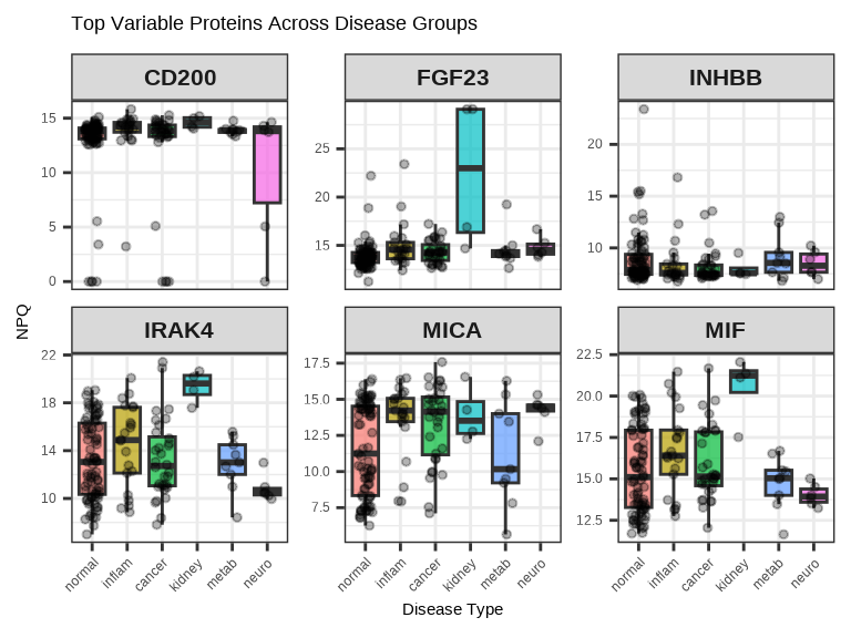
3.4.5 Protein-Protein Correlation
# Select two proteins to compare
protein1 <- "IL6"
protein2 <- "TNF"

plot_data <- data_long %>%
  filter(Target %in% c(protein1, protein2), SampleName %in% sample_list) %>%
  select(SampleName, Target, NPQ, disease_type) %>%
  pivot_wider(names_from = Target, values_from = NPQ)

ggplot(plot_data, aes(x = .data[[protein1]], y = .data[[protein2]],
                      color = disease_type)) +
  geom_point(size = 1, alpha = 0.7) +
  geom_smooth(method = "lm", se = FALSE, color = "black", linetype = "dashed") +
  labs(title = paste(protein1, "vs", protein2),
       x = paste(protein1, "NPQ"),
       y = paste(protein2, "NPQ"),
       color = "Disease Type")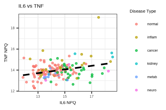
3.5 Saving Plots
Both generate_heatmap() and generate_pca() have built-in options to save plots directly.
Save Heatmap
# Automatically saves to file
generate_heatmap(
  data = data$merged$Data_NPQ,
  sampleInfo = metadata,
  sampleName_var = "SampleName",
  sample_subset = sample_list,
  annotate_sample_by = c("disease_type", "sex"),
  output_dir = "figures",              # Where to save
  plot_name = "heatmap.pdf",           # Filename (PDF, PNG, JPG, SVG)
  plot_title = "Expression Heatmap",
  plot_width = 10,                     # Width in inches
  plot_height = 8                      # Height in inches
)
Supported formats: PDF, PNG, JPG, SVG (determined by file extension)
Save PCA
# Automatically saves to file
generate_pca(
  data = data$merged$Data_NPQ,
  sampleInfo = metadata,
  sampleName_var = "SampleName",
  sample_subset = sample_list,
  annotate_sample_by = "disease_type",
  output_dir = "figures",              # Where to save
  plot_name = "pca.png",               # Filename (PDF, PNG, JPG, SVG)
  plot_title = "PCA Plot",
  plot_width = 8,                      # Width in inches
  plot_height = 6                      # Height in inches
)
Supported formats: PDF, PNG, JPG, SVG (determined by file extension)
3.6 Visualization Best Practices
Before Plotting
- Remove low-quality samples/proteins or outliers
- Decide on sample subset (if analyzing only certain samples)
- Choose appropriate color schemes (consider color-blind friendly palettes)
Design Principles
- Use clear, descriptive titles
- Label axes properly with units
- Include legends when needed
- Choose appropriate plot types for your data
Interpretation
- Always view plots in context of experimental design
- Look for biological signals first, then technical artifacts
- Compare results across multiple visualization methods
- Document interesting patterns for follow-up
Common Issues
- ✗ Plotting too many groups (hard to distinguish)
- ✗ Poor color choices (e.g., red/green for color-blind viewers)
- ✗ Overplotting (too many points overlapping)
- ✗ Missing axis labels or legends
3.7 Complete Visualization Workflow
# Load libraries
library(NULISAseqR)
library(tidyverse)

# Set up output directory
out_dir <- "figures"
dir.create(out_dir, showWarnings = FALSE)

# Filter to samples of interest
sample_list <- metadata %>%
  filter(SampleMatrix == "Plasma") %>%
  pull(SampleName)

# 1. Generate heatmap with annotations
generate_heatmap(
  data = data$merged$Data_NPQ,
  output_dir = out_dir,
  plot_name = "expression_heatmap.pdf",
  plot_title = "Protein Expression Heatmap",
  sampleInfo = metadata,
  sampleName_var = "SampleName",
  sample_subset = sample_list,
  annotate_sample_by = c("disease_type", "sex", "age"),
  plot_width = 12,
  plot_height = 10
)

# 2. Generate PCA plot
generate_pca(
  data = data$merged$Data_NPQ,
  output_dir = out_dir,
  plot_name = "pca_plot.pdf",
  plot_title = "PCA of Protein Expression",
  sampleInfo = metadata,
  sampleName_var = "SampleName",
  sample_subset = sample_list,
  annotate_sample_by = "disease_type",
  shape_by = "sex",
  plot_width = 8,
  plot_height = 6
)

# 3. NPQ distribution histogram
p_hist <- data_long %>%
  filter(SampleName %in% sample_list) %>%
  ggplot(aes(x = NPQ)) +
  geom_histogram(bins = 50, fill = "steelblue", alpha = 0.7) +
  labs(title = "Distribution of NPQ Values",
       x = "NPQ", y = "Count")

ggsave(file.path(out_dir, "npq_histogram.pdf"), p_hist,
       width = 7, height = 5)

# 4. NPQ density by disease type
p_density <- data_long %>%
  filter(SampleName %in% sample_list) %>%
  ggplot(aes(x = NPQ, fill = disease_type)) +
  geom_density(alpha = 0.5) +
  labs(title = "NPQ Distribution by Disease Type",
       x = "NPQ", y = "Density",
       fill = "Disease Type")

ggsave(file.path(out_dir, "npq_density.pdf"), p_density,
       width = 8, height = 5)

# 5. Single protein boxplot
protein_of_interest <- "IL6"

p_single <- data_long %>%
  filter(Target == protein_of_interest, SampleName %in% sample_list) %>%
  ggplot(aes(x = disease_type, y = NPQ, fill = disease_type)) +
  geom_boxplot(alpha = 0.7, outlier.shape = NA) +
  geom_jitter(width = 0.2, alpha = 0.6, size = 2) +
  labs(title = paste(protein_of_interest, "Expression Across Groups"),
       x = "Disease Type", y = "NPQ") +
  theme(legend.position = "none",
        axis.text.x = element_text(angle = 45, hjust = 1))

ggsave(file.path(out_dir, paste0(protein_of_interest, "_boxplot.pdf")),
       p_single, width = 7, height = 5)

# 6. Multiple proteins facet plot
protein_variance <- apply(data$merged$Data_NPQ[, sample_list], 1,
                          var, na.rm = TRUE)
top_proteins <- names(sort(protein_variance, decreasing = TRUE)[1:6])

p_multi <- data_long %>%
  filter(Target %in% top_proteins, SampleName %in% sample_list) %>%
  ggplot(aes(x = disease_type, y = NPQ, fill = disease_type)) +
  geom_boxplot(alpha = 0.7, outlier.shape = NA) +
  geom_jitter(width = 0.2, alpha = 0.3, size = 1) +
  facet_wrap(~Target, scales = "free_y", ncol = 3) +
  labs(title = "Top Variable Proteins Across Disease Groups",
       x = "Disease Type", y = "NPQ") +
  theme(legend.position = "none",
        axis.text.x = element_text(angle = 45, hjust = 1),
        strip.text = element_text(size = 12, face = "bold"))

ggsave(file.path(out_dir, "top_proteins_facet.pdf"), p_multi,
       width = 10, height = 8)

# 7. Protein correlation plot
protein1 <- "IL6"
protein2 <- "TNF"

plot_data <- data_long %>%
  filter(Target %in% c(protein1, protein2), SampleName %in% sample_list) %>%
  select(SampleName, Target, NPQ, disease_type) %>%
  pivot_wider(names_from = Target, values_from = NPQ) %>%
  na.omit()

p_corr <- ggplot(plot_data,
                 aes(x = .data[[protein1]], y = .data[[protein2]],
                     color = disease_type)) +
  geom_point(size = 3, alpha = 0.7) +
  geom_smooth(method = "lm", se = TRUE, color = "black",
              linetype = "dashed", linewidth = 0.5) +
  labs(title = paste(protein1, "vs", protein2),
       x = paste(protein1, "NPQ"),
       y = paste(protein2, "NPQ"),
       color = "Disease Type")

ggsave(file.path(out_dir, "protein_correlation.pdf"), p_corr,
       width = 7, height = 6)

cat("\n✓ All visualizations saved to:", out_dir, "\n")
cat("\nGenerated files:\n")
cat("  - expression_heatmap.pdf\n")
cat("  - pca_plot.pdf\n")
cat("  - npq_histogram.pdf\n")
cat("  - npq_density.pdf\n")
cat("  - IL6_boxplot.pdf\n")
cat("  - top_proteins_facet.pdf\n")
cat("  - protein_correlation.pdf\n")
Continue to: Chapter 4: Differential Expression Analysis