Chapter 6 Outcome Modeling
This chapter covers using protein expression as predictors to model outcomes, including both continuous and binary responses.
6.1 Overview
While differential expression asks “What proteins differ between groups?”, predictive modeling explores “Which proteins are associated with an outcome, and how well do these associations explain or predict it?”
In this context, “prediction” does not necessarily imply clinical forecasting. Instead, it refers to building statistical models that quantify the relationship between protein abundance and a phenotype or outcome. These models use protein expression levels as predictors to identify proteins associated with biological variation or sample classification.
NULISAseqR provides four functions for outcome modeling:
Fixed Effects Models:
lmNULISAseq_predict(): For continuous outcomes (linear regression)glmNULISAseq_predict(): For binary or count outcomes (generalized linear models, including logistic, Poisson, etc.)
Mixed Effects Models:
lmerNULISAseq_predict(): For continuous outcomes with repeated measures or hierarchical data (linear mixed-effects models)glmerNULISAseq_predict(): For binary or count outcomes with repeated measures or hierarchical data (generalized linear mixed-effects models)
In this chapter, we will focus on the fixed effects models: lmNULISAseq_predict() for continuous outcomes and glmNULISAseq_predict() for binary outcomes.
6.2 Example 1: Exploring Age Associations (Continuous Outcome)
Age is a great continuous outcome for regression modeling because it is objectively measured, precisely recorded, and biologically meaningful — many protein expression patterns naturally vary with aging.
6.2.1 Why Model Age?
- Identify proteins associated with aging
- Explore potential biological age biomarkers
- Understand how protein expression relates to age
- Validate that your proteomic data captures true biological signal
6.2.2 Age Distribution in the Dataset
# Check age distribution in the Detectability Study dataset used in differential expression analysis
summary(metadata$age)
#> Min. 1st Qu. Median Mean 3rd Qu. Max. NA's
#> 0.0 42.0 55.0 54.3 65.0 86.0 18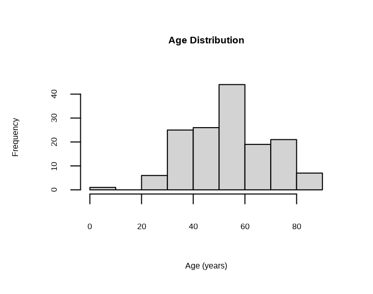
Note: The dataset contains a sample with age = 0, which likely represents missing or erroneous data. We will exclude this sample from the age association analysis.
# Exclude samples with age = 0
metadata_age <- metadata %>% filter(age > 0)
sample_list_age <- metadata_age$SampleName

cat("Samples with valid age:", nrow(metadata_age), "\n")
#> Samples with valid age: 1486.2.4 Understanding the Age Model
For each protein, the model is:
age ~ Protein Expression + disease_type + sexThis tests: “Is this protein associated with age, after accounting for disease type and sex?”
The coefficient shows the estimated change in age per unit increase in protein expression (NPQ).
6.2.5 Examining Age Association Results
#> [1] "modelStats"#> Preview of Age Association Results (rounded to 3 digits):Key Columns in Results
target: Protein nametarget_coef: Estimated change in years of age per unit NPQtarget_pval: Raw p-value (is this protein significantly associated with age?)target_pval_FDR: FDR-adjusted p-valuetarget_pval_bonf: Bonferroni-adjusted p-value
6.2.6 Finding Age-Associated Proteins
We will identify proteins that are significantly associated with age with FDR-adjusted p value < 0.05.
# Find proteins that significantly associated with age
age_proteins <- lmpt_age$modelStats %>%
filter(target_pval_FDR < 0.05) %>%
arrange(target_pval_FDR) %>%
select(target, target_coef, target_pval_FDR)
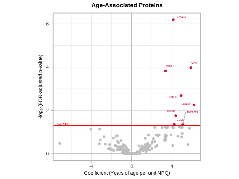
cat("Number of proteins significantly associated with age:", nrow(age_proteins), "\n\n")#> Number of proteins significantly associated with age: 8#> Age-Associated Proteins:
We can further identify proteins that are either significantly increased or decreased with age.
# Proteins that increase with age (positive coefficients)
age_increase <- age_proteins %>%
  filter(target_coef > 0) %>%
  arrange(desc(abs(target_coef)))

# Proteins that decrease with age (negative coefficients)
age_decrease <- age_proteins %>%
  filter(target_coef < 0) %>%
  arrange(desc(abs(target_coef)))

cat("Number of proteins significantly increase with age:", nrow(age_increase), "\n\n")
#> Number of proteins significantly increase with age: 8#> Number of proteins significantly decrease with age: 0
Interpretation:
- GFAP has
target_coef = 5.76, this means for every 1-unit increase in NPQ (2-fold increase in GFAP), age increases by 5.76 years on average - GDF15 has
target_coef = 4.25, this means for every 1-unit increase in NPQ (2-fold increase in GDF15), age increases by 4.25 years on average - CXCL14 has
target_coef = 3.47, this means for every 1-unit increase in NPQ (2-fold increase in CXCL14), age increases by 3.47 years on average - CHI3L1 has
target_coef = 3.33, this means for every 1-unit increase in NPQ (2-fold increase in CHI3L1), age increases by 3.33 years on average
6.2.7 Volcano Plots
volcanoPlot(
  coefs = lmpt_age$modelStats$target_coef,
  p_vals = lmpt_age$modelStats$target_pval_FDR,
  target_labels = lmpt_age$modelStats$target,
  title = "Age-Associated Proteins",
  xlab = "Coefficient (Years of age per unit NPQ)",
)
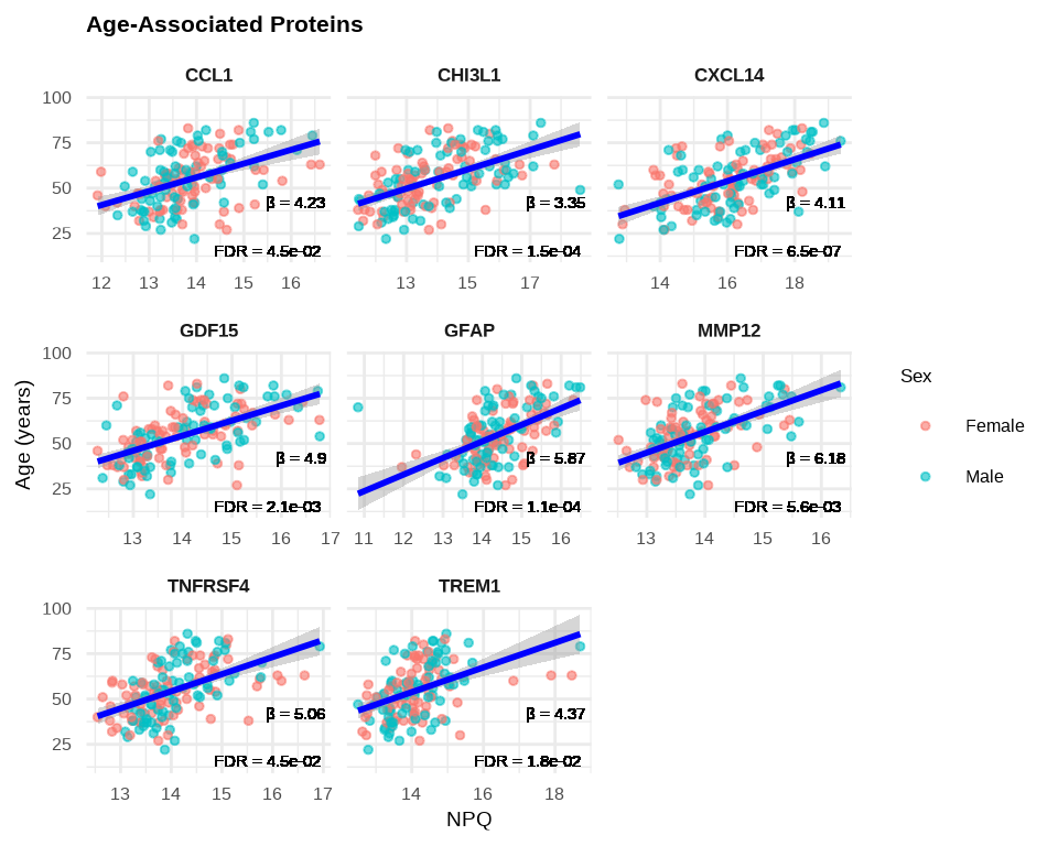
6.2.8 Visualizing Age-Associated Proteins
# Create labels with available statistics
stat_labels <- lmpt_age$modelStats %>%
  filter(target %in% age_proteins$target) %>%
  select(target, target_coef, target_pval_FDR) %>%
  mutate(label = paste0(
    "β = ", round(target_coef, 2), "\n",
    "FDR = ", format(target_pval_FDR, digits = 2, scientific = TRUE)
  ))

plot_data_age <- data_long %>%
  filter(Target %in% age_proteins$target,
         SampleName %in% sample_list_age) %>%
  left_join(stat_labels, by = c("Target" = "target"))

# Plot age-associated proteins
ggplot(plot_data_age, aes(x = NPQ, y = age)) +
  geom_point(aes(color = sex), alpha = 0.6, size = 1) +
  geom_smooth(method = "lm", se = TRUE, color = "blue", linewidth = 1) +
  geom_text(aes(label = label),
            x = Inf, y = -Inf,
            hjust = 1.1, vjust = -0.1,
            size = 4, color = "black") +
  facet_wrap(~ Target, scales = "free_x") +
  theme_minimal() +
  labs(title = "Age-Associated Proteins",
       x = "NPQ",
       y = "Age (years)",
       color = "Sex") +
  theme(
    strip.text = element_text(size = 13, face = "bold"),
    plot.title = element_text(size = 16, face = "bold"),
    axis.title.x = element_text(size = 14),
    axis.title.y = element_text(size = 14),
    axis.text.x = element_text(size = 12),
    axis.text.y = element_text(size = 12),
    legend.title = element_text(size = 13),
    legend.text = element_text(size = 12)
    )
6.3 Example 2: Modeling Disease Status (Binary Outcome)
Now we’ll use logistic regression to model the association between protein expression and disease status (inflammation vs normal), adjusting for age and sex.
6.3.1 Disease Status as Binary Outcome
Question: Which proteins are associated with inflammation after accounting for age and sex?
Unlike differential expression which compares group means, logistic regression models the relationship between continuous protein expression and a binary outcome (disease present/absent) while adjusting for other factors.
6.3.2 Preparing the Disease Data
# Subset metadata for inflammation and normal samples only
metadata_disease <- metadata %>%
  filter(disease_type %in% c("normal", "inflam")) %>%
  mutate(disease_binary = ifelse(disease_type == "inflam", 1, 0))

# Check outcome distribution
cat("Sample distribution:\n")
#> Sample distribution:#>
#> 0 1
#> normal 79 0
#> inflam 0 21
#> cancer 0 0
#> kidney 0 0
#> metab 0 0
#> neuro 0 06.3.3 Building the Disease Association Model
# Fit logistic regression models for ALL proteins
glmt_disease <- glmNULISAseq_predict(
  data = data$merged$Data_NPQ[, disease_sample_list],
  sampleInfo = metadata_disease,
  sampleName_var = "SampleName",
  response_var = "disease_binary",
  modelFormula = "sex + age"  # Adjust for sex and age as covariates
)
6.3.4 Understanding the Disease Model
For each protein, the model is:
log(odds of inflammation) ~ Protein Expression + sex + ageThis tests: “Is this protein associated with disease status (inflammation vs normal), after accounting for sex and age?”
6.3.5 Examining Disease Association Results
#> [1] "modelStats"#> Preview of Disease Association Results (rounded to 3 digits):Key Columns in Results
target: Protein nametarget_coef: Log odds ratio (raw coefficient)target_OR: Odds ratio = exp(target_coef)target_se: Standard error of the coefficienttarget_zval: Z-value (Wald statistic)target_pval: Raw p-value (Wald test)target_pval_FDR: FDR-adjusted p-value
6.3.6 Finding Disease-Associated Proteins
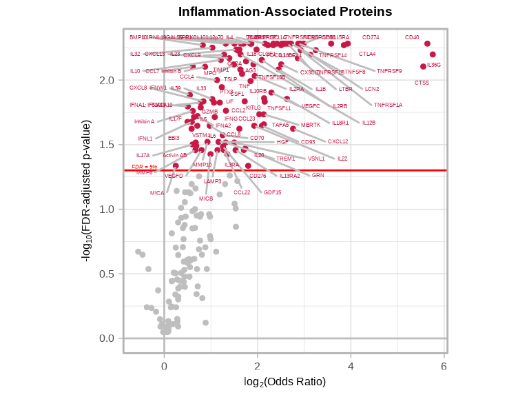
We will identify proteins that are significantly associated with the odds of inflammation with FDR-adjusted p value < 0.05.
# Find proteins significantly associated with disease status
disease_proteins <- glmt_disease$modelStats %>%
  filter(target_pval_FDR < 0.05) %>%
  arrange(target_pval_FDR) %>%
  select(target, target_coef, target_OR, target_pval_FDR)

cat("Proteins significantly associated with disease status (FDR < 0.05):",
    nrow(disease_proteins), "\n")
#> Proteins significantly associated with disease status (FDR < 0.05): 1056.3.7 Interpreting Odds Ratios
# Strong positive associations with inflammation (OR > 1)
inflam_associated <- disease_proteins %>%
  filter(target_OR > 1) %>%
  arrange(desc(target_OR))

cat("Number of proteins with significantly POSITIVE association with inflammation:", nrow(inflam_associated), "\n\n")
#> Number of proteins with significantly POSITIVE association with inflammation: 105# Strong negative associations with inflammation (OR < 1)
normal_associated <- disease_proteins %>%
filter(target_OR < 1) %>%
arrange(target_OR)
cat("Number of proteins with significantly NEGATIVE association with inflammation:", nrow(normal_associated), "\n\n")#> Number of proteins with significantly NEGATIVE association with inflammation: 0
Odds Ratio Interpretation:
- OR = 1: No association with disease status
- OR = 2: Each 1-unit increase in protein expression (NPQ) is associated with 2 times higher odds of inflammation
- OR = 0.5: Each 1-unit increase in protein expression is associated with half the odds of inflammation
- OR > 2: Strong positive association (higher protein → greater odds of inflammation)
- OR < 0.5: Strong negative association (higher protein → lower odds of inflammation)
6.3.8 Disease-Associated Proteins Volcano Plots
volcanoPlot(
  coefs = glmt_disease$modelStats$target_coef,
  p_vals = glmt_disease$modelStats$target_pval_FDR,
  target_labels = glmt_disease$modelStats$target,
  title = "Inflammation-Associated Proteins",
  xlab = expression("log"[2] * "(Odds Ratio)")
)
6.3.9 Comparing with Differential Expression Results
We can compare these logistic regression results with the differential expression analysis from Chapter 4 to understand how the two approaches complement each other.
# Reference differential expression results from Chapter 4
# sig_inflam contains proteins with FDR < 0.05 from DE analysis

# Merge ALL GLM and DE results
comparison_all <- glmt_disease$modelStats %>%
  select(target, target_coef, target_OR, target_se, target_pval_FDR) %>%
  left_join(
    sig_inflam %>%
      select(target, disease_typeinflam_coef, disease_typeinflam_pval_FDR),
    by = "target",
    suffix = c("_glm", "_de")
  ) %>%
  mutate(
    sig_glm = target_pval_FDR < 0.05,
    sig_de = disease_typeinflam_pval_FDR < 0.05,
    category = case_when(
      sig_glm & sig_de ~ "Both",
      sig_glm & !sig_de ~ "GLM only",
      !sig_glm & sig_de ~ "DE only",
      TRUE ~ "Neither"
    )
  )

# Summary table
cat("\nSignificance Categories:\n")
#>
#> Significance Categories:#>
#> Both DE only Neither
#> 84 10 1126.3.9.1 Venn Diagram of Significant Proteins
library(ggVennDiagram)

# Create list for Venn diagram
de_sig_list <- comparison_all %>% filter(sig_de) %>% pull(target)
glm_sig_list <- comparison_all %>% filter(sig_glm) %>% pull(target)

venn_list <- list(
  "Differential\nExpression" = de_sig_list,
  "Logistic\nRegression" = glm_sig_list
)

# Create Venn diagram with ggplot2
ggVennDiagram(venn_list,
              label_alpha = 0,
              label_color = "white") +
  scale_fill_gradient(low = "lightblue", high = "darkblue") +
  theme(legend.position = "none") +
  scale_x_continuous(expand = expansion(mult = .2)) +
  labs(title = "Overlap Between DE and GLM Significant Proteins")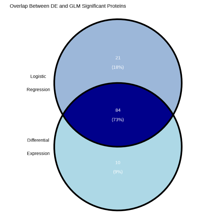
# Calculate overlap statistics
overlap_count <- length(intersect(de_sig_list, glm_sig_list))
de_only_count <- length(setdiff(de_sig_list, glm_sig_list))
glm_only_count <- length(setdiff(glm_sig_list, de_sig_list))

cat("\nVenn Diagram Summary:\n")
#>
#> Venn Diagram Summary:#> DE only: 10#> GLM only: 21#> Both (overlap): 84#> Total unique significant proteins: 115Why might results differ between DE and GLM?
Even when using the same samples and adjusting for the same covariates (e.g., sex and age), differential expression and logistic regression results may differ due to fundamental differences in their statistical frameworks:
Different Research Questions
- Differential Expression (Linear Model): Tests whether mean protein expression differs between groups
- Question: “Is average expression higher in disease vs. normal?”
- Logistic Regression (GLM): Tests whether protein expression predicts disease probability
- Question: “Does protein level predict the odds of having disease?”
Different Statistical Assumptions
- Error Distribution
- Linear models assume normally distributed residuals (continuous errors)
- Logistic regression assumes binomially distributed outcomes (0/1 responses)
- Link Function
- Linear models use an identity link (direct linear relationship)
- Logistic regression uses a logit link (log-odds scale)
- Relationship with Outcome
- Linear models assume linear changes in expression between groups
- Logistic regression captures nonlinear (S-shaped) probability curves
- Variance Structure
- Linear models assume constant variance across groups (homoscedasticity)
- Logistic regression allows variance to depend on probability: p × (1 − p)
Practical Implications
- Sensitivity to Data Patterns
- Linear models can be more influenced by outliers in expression values
- Logistic regression is more sensitive to samples near the classification boundary (probability ≈ 0.5)
- Effect Size Interpretation
- Linear models report mean differences in expression (e.g., log₂ fold change)
- Logistic regression reports odds ratios for disease association
- Statistical Power
- Methods may have different power depending on data distribution and sample size
- One approach may detect effects the other misses
When Results Agree
Strong, consistent protein changes typically show significance in both analyses, with concordant directions (upregulated proteins have OR > 1; downregulated proteins have OR < 1).
When Results Diverge
- Significant in DE only: Protein differs between groups on average, but doesn’t strongly predict individual disease status (perhaps due to high within-group variability)
- Significant in GLM only: Protein may show a dose-response relationship with disease probability that isn’t captured by simple group comparisons
6.3.9.2 Proteins Significant in Both Analyses
both_sig <- comparison_all %>%
  filter(category == "Both") %>%
  mutate(
    de_direction = ifelse(disease_typeinflam_coef > 0, "Up in Inflam", "Down in Inflam"),
    glm_direction = ifelse(target_OR > 1, "Assoc w/ Inflam", "Assoc w/ Normal"),
    consistent = (disease_typeinflam_coef > 0 & target_OR > 1) |
                 (disease_typeinflam_coef < 0 & target_OR < 1)
  ) %>%
  arrange(target_pval_FDR)

cat("\nProteins significant in BOTH analyses:", nrow(both_sig), "\n")
#>
#> Proteins significant in BOTH analyses: 84#> Direction consistent: 84#> Direction inconsistent: 0
Expected Pattern:
- Proteins upregulated in inflammation (positive DE coefficient) should have OR > 1
- Proteins downregulated in inflammation (negative DE coefficient) should have OR < 1
6.3.9.3 Proteins Significant in GLM Only
glm_only <- comparison_all %>%
  filter(category == "GLM only") %>%
  arrange(target_pval_FDR)

cat("\nProteins significant in GLM but NOT in DE:", nrow(glm_only), "\n")
#>
#> Proteins significant in GLM but NOT in DE: 06.3.9.4 Proteins Significant in DE Only
de_only <- comparison_all %>%
  filter(category == "DE only") %>%
  arrange(disease_typeinflam_pval_FDR)

cat("\nProteins significant in DE but NOT in GLM:", nrow(de_only), "\n")
#>
#> Proteins significant in DE but NOT in GLM: 106.3.9.5 Visualizing DE effect size vs GLM Odds Ratios
The scatter plot below compares effect sizes from differential expression (DE) and logistic regression (GLM) analyses. Proteins that show consistent effects across both methods appear along the diagonal, while discordant results appear off the diagonal.
# Scatter plot: DE coefficient vs log2(OR)
ggplot(comparison_all %>% filter(sig_de | sig_glm),
       aes(x = disease_typeinflam_coef, y = log2(target_OR))) +
  geom_point(aes(color = category, size = -log10(target_pval_FDR)), alpha = 0.6) +
  geom_hline(yintercept = 0, linetype = "dashed", color = "gray50") +
  geom_vline(xintercept = 0, linetype = "dashed", color = "gray50") +
  scale_color_manual(values = c("Both" = "#E41A1C",
                                "GLM only" = "#377EB8",
                                "DE only" = "#4DAF4A")) +
  theme_minimal() +
  labs(title = "Comparison of DE and GLM Effect Sizes",
       subtitle = "Proteins significant in at least one analysis",
       x = "DE Coefficient (Inflam vs Normal)",
       y = "log2(Odds Ratio) from GLM",
       color = "Significant in",
       size = "-log10(GLM p-value)") +
  theme(legend.position = "right",
        plot.title = element_text(size = 16, face = "bold"),
        axis.title = element_text(size = 14),
        axis.text = element_text(size = 12),
        legend.title = element_text(size = 13),
        legend.text = element_text(size = 12))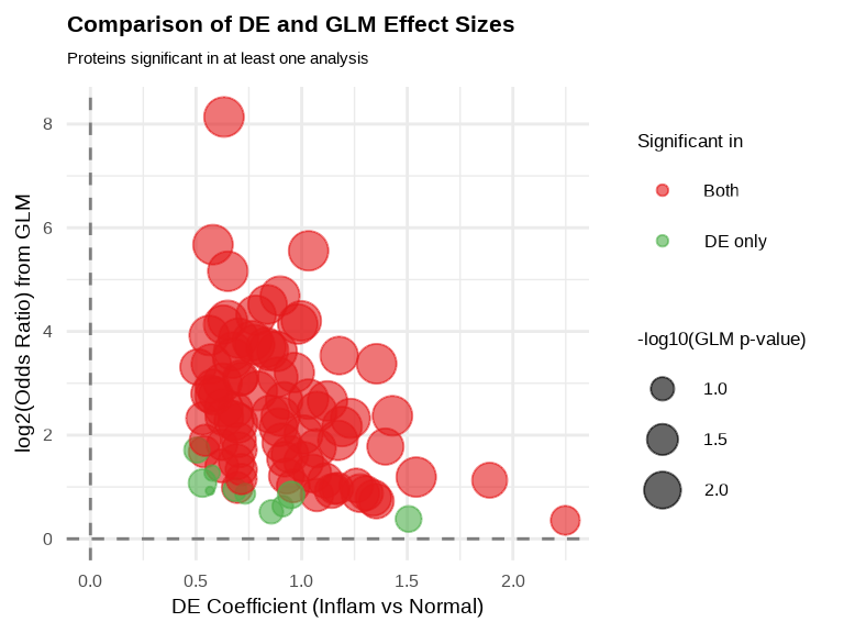
6.3.10 Visualizing Disease Associations
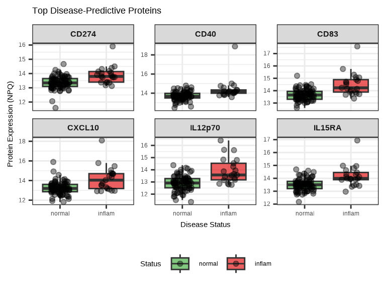
# Plot top 6 disease-predictive proteins
top_6_disease <- disease_proteins$target[1:6]

# Box plots
data_long %>%
  filter(Target %in% top_6_disease, SampleName %in% inflam_samples) %>%
ggplot(aes(x = disease_type, y = NPQ, fill = disease_type)) +
  geom_boxplot(alpha = 0.7, outlier.shape = NA) +
  geom_jitter(width = 0.2, alpha = 0.4, size = 1.5) +
  facet_wrap(~ Target, scales = "free_y", ncol = 3) +
  scale_fill_manual(values = c("normal" = "#4DAF4A", "inflam" = "#E41A1C")) +
  labs(title = "Top Disease-Predictive Proteins",
       x = "Disease Status",
       y = "Protein Expression (NPQ)",
       fill = "Status") +
  theme(
    strip.text = element_text(size = 12, face = "bold"),
    legend.position = "bottom"
  )
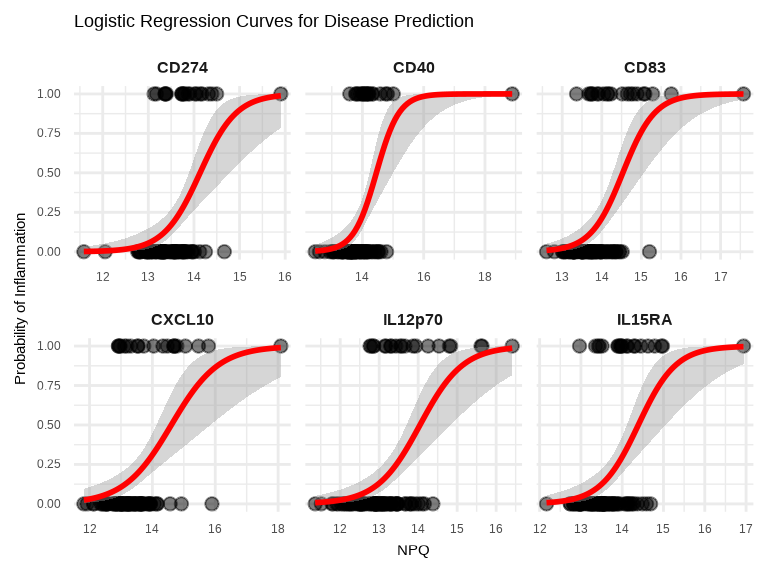
# Logistic curve visualization for top 6 proteins
data_long %>%
  filter(Target %in% top_6_disease, SampleName %in% inflam_samples) %>%
  left_join(
    metadata_disease %>% select(SampleName, disease_binary),
    by = "SampleName"
  ) %>%
  ggplot(aes(x = NPQ, y = disease_binary)) +
  geom_point(alpha = 0.5, size = 2) +
  geom_smooth(method = "glm", method.args = list(family = "binomial"),
              se = TRUE, color = "red", linewidth = 1) +
  facet_wrap(~ Target, scales = "free_x", ncol = 3) +
  theme_minimal() +
  labs(title = "Logistic Regression Curves for Disease Prediction",
       x = "NPQ",
       y = "Probability of Inflammation") +
  theme(
    strip.text = element_text(size = 12, face = "bold")
    )
6.3.11 ROC Curves for Disease-Associated Proteins
library(pROC)

# Prepare data for ROC analysis
roc_data <- data_long %>%
  filter(Target %in% top_6_disease, SampleName %in% disease_sample_list) %>%
  left_join(metadata_disease %>% select(SampleName, disease_binary),
            by = "SampleName")

# Calculate ROC curves and AUC for each protein
roc_plot_data <- do.call(rbind, lapply(top_6_disease, function(protein) {
  # Filter data for current protein
  protein_data <- roc_data %>% filter(Target == protein)

  # Calculate ROC
  roc_obj <- roc(protein_data$disease_binary, protein_data$NPQ, quiet = TRUE)

  # Extract ROC data and AUC
  data.frame(
    Target = protein,
    Sensitivity = roc_obj$sensitivities,
    Specificity = roc_obj$specificities,
    AUC = round(as.numeric(auc(roc_obj)), 3)
  )
}))

# Create annotation data
annotation_data <- unique(roc_plot_data[, c("Target", "AUC")])
annotation_data$label <- paste0("AUC = ", annotation_data$AUC)

# Create ROC curve plot
ggplot(roc_plot_data, aes(x = 1 - Specificity, y = Sensitivity)) +
  geom_line(color = "#E41A1C", linewidth = 1) +
  geom_abline(slope = 1, intercept = 0, linetype = "dashed", color = "gray50") +
  geom_text(data = annotation_data,
            aes(x = 0.7, y = 0.15, label = label),
            size = 3.5, hjust = 0.1) +
  facet_wrap(~ Target, ncol = 3) +
  theme_minimal() +
  labs(title = "ROC Curves for Top Disease-Associated Proteins",
       x = "1 - Specificity (False Positive Rate)",
       y = "Sensitivity (True Positive Rate)") +
  theme(
    strip.text = element_text(size = 13, face = "bold"),
    plot.title = element_text(size = 14, face = "bold"),
    axis.title = element_text(size = 12),
    axis.text = element_text(size = 10)
  ) +
  coord_equal()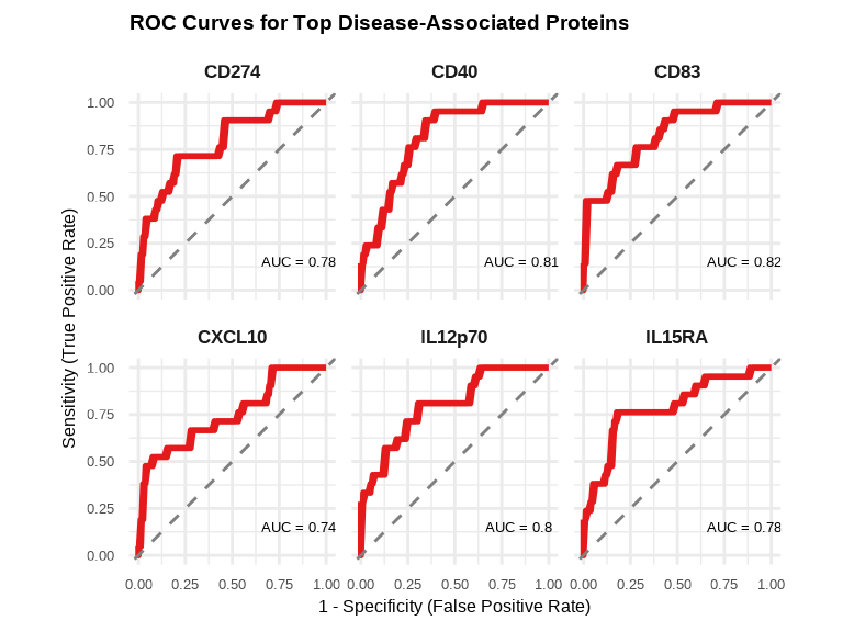
6.4 Comparing Approaches
6.4.1 When to Use Each Function
Differential Expression (lmNULISAseq)
- Goal: Find proteins that differ between groups
- Proteins are outcomes, groups are predictors
- Example: “Which proteins differ in inflammation vs normal?”
Continuous Outcome (lmNULISAseq_predict)
- Goal: Identify proteins associated with a continuous outcome
- Proteins are predictors, continuous variable is outcome
- Example: “Which proteins are associated with age or disease severity score?”
Binary Outcome (glmNULISAseq_predict)
- Goal: Identify proteins associated with a binary outcome
- Proteins are predictors, binary variable is outcome
- Example: “Which proteins are associated with a binary disease status?”
6.5 Exporting Results
Save your association modeling results for downstream analysis or reporting:
# Save age association results
write_csv(lmpt_age$modelStats, "results/age_association_all_proteins.csv")
write_csv(age_proteins, "results/age_associated_proteins_significant.csv")

# Save disease association results
write_csv(glmt_disease$modelStats, "results/disease_association_all_proteins.csv")
write_csv(disease_proteins, "results/disease_associated_proteins_significant.csv")

# Save comparison results
write_csv(comparison_all, "results/de_vs_glm_comparison.csv")
write_csv(both_sig, "results/proteins_significant_in_both.csv")
write_csv(glm_only, "results/proteins_glm_only.csv")
write_csv(de_only, "results/proteins_de_only.csv")
6.6 Complete Outcome Modeling Workflow
Here’s a complete workflow example that you can adapt for your own data:
# Load libraries
library(NULISAseqR)
library(tidyverse)
library(ggVennDiagram)
library(pROC)

# 1. Continuous Outcome: Age Association
## Check age distribution in the Detectability Study dataset used in differential expression analysis
summary(metadata$age)
hist(metadata$age, main = "Age Distribution", xlab = "Age (years)")

## Exclude samples with age = 0
metadata_age <- metadata %>% filter(age > 0)
sample_list_age <- metadata_age$SampleName

## Fit linear models
lmpt_age <- lmNULISAseq_predict(
  data = data$merged$Data_NPQ[, sample_list_age],
  sampleInfo = metadata_age,
  sampleName_var = "SampleName",
  response_var = "age",
  modelFormula = "disease_type + sex"
)

## Identify significant age-associated proteins
age_proteins <- lmpt_age$modelStats %>%
  filter(target_pval_FDR < 0.05) %>%
  arrange(target_pval_FDR)

cat("Proteins associated with age:", nrow(age_proteins), "\n\n")

## Volcano plot for age-associated proteins
volcanoPlot(
  coefs = lmpt_age$modelStats$target_coef,
  p_vals = lmpt_age$modelStats$target_pval_FDR,
  target_labels = lmpt_age$modelStats$target,
  title = "Age-Associated Proteins",
  xlab = "Coefficient (Years of age per unit NPQ)",
)

## Plot age-associated proteins
stat_labels <- lmpt_age$modelStats %>%
  filter(target %in% age_proteins$target) %>%
  select(target, target_coef, target_pval_FDR) %>%
  mutate(label = paste0(
    "β = ", round(target_coef, 2), "\n",
    "FDR = ", format(target_pval_FDR, digits = 2, scientific = TRUE)
  ))

plot_data_age <- data_long %>%
  filter(Target %in% age_proteins$target,
         SampleName %in% sample_list_age) %>%
  left_join(stat_labels, by = c("Target" = "target"))

# Plot age-associated proteins
ggplot(plot_data_age, aes(x = NPQ, y = age)) +
  geom_point(aes(color = sex), alpha = 0.6, size = 1) +
  geom_smooth(method = "lm", se = TRUE, color = "blue", linewidth = 1) +
  geom_text(aes(label = label),
            x = Inf, y = -Inf,
            hjust = 1.1, vjust = -0.1,
            size = 4, color = "black") +
  facet_wrap(~ Target, scales = "free_x") +
  theme_minimal() +
  labs(title = "Age-Associated Proteins",
       x = "NPQ",
       y = "Age (years)",
       color = "Sex") +
  theme(
    strip.text = element_text(size = 13, face = "bold"),
    plot.title = element_text(size = 16, face = "bold"),
    axis.title.x = element_text(size = 14),
    axis.title.y = element_text(size = 14),
    axis.text.x = element_text(size = 12),
    axis.text.y = element_text(size = 12),
    legend.title = element_text(size = 13),
    legend.text = element_text(size = 12)
    )

# 2. Binary Outcome: Disease Status
## Prepare binary outcome
metadata_disease <- metadata %>%
  filter(disease_type %in% c("normal", "inflam")) %>%
  mutate(disease_binary = ifelse(disease_type == "inflam", 1, 0))

disease_sample_list <- metadata_disease$SampleName

## Fit logistic regression models
glmt_disease <- glmNULISAseq_predict(
  data = data$merged$Data_NPQ[, disease_sample_list],
  sampleInfo = metadata_disease,
  sampleName_var = "SampleName",
  response_var = "disease_binary",
  modelFormula = "sex + age"
)

## Identify significant associations
disease_proteins <- glmt_disease$modelStats %>%
  filter(target_pval_FDR < 0.05) %>%
  arrange(target_pval_FDR)

cat("Proteins associated with disease:", nrow(disease_proteins), "\n\n")

## Identify proteins with positive associations with inflammation (OR > 1)
inflam_associated <- disease_proteins %>%
  filter(target_OR > 1) %>%
  arrange(desc(target_OR))

cat("Number of proteins with significantly POSITIVE association with inflammation:", nrow(inflam_associated), "\n\n")

# Identify proteins with negative associations with inflammation (OR < 1)
normal_associated <- disease_proteins %>%
  filter(target_OR < 1) %>%
  arrange(target_OR)

cat("Number of proteins with significantly NEGATIVE association with inflammation:", nrow(normal_associated), "\n\n")

## Volcano plot for disease-associated proteins
volcanoPlot(
  coefs = glmt_disease$modelStats$target_coef,
  p_vals = glmt_disease$modelStats$target_pval_FDR,
  target_labels = glmt_disease$modelStats$target,
  title = "Inflammation-Associated Proteins",
  xlab = expression("log"[2] * "(Odds Ratio)")
)

# 3. Compare with DE results
## Merge results
comparison_all <- glmt_disease$modelStats %>%
  select(target, target_OR, target_pval_FDR) %>%
  left_join(
    sig_inflam %>% select(target, disease_typeinflam_coef, disease_typeinflam_pval_FDR),
    by = "target",
    suffix = c("_glm", "_de")
  ) %>%
  mutate(
    sig_glm = target_pval_FDR < 0.05,
    sig_de = disease_typeinflam_pval_FDR < 0.05,
    category = case_when(
      sig_glm & sig_de ~ "Both",
      sig_glm & !sig_de ~ "GLM only",
      !sig_glm & sig_de ~ "DE only",
      TRUE ~ "Neither"
    )
  )

cat("Significance categories:\n")
print(table(comparison_all$category))

## Venn diagram of overlap
de_sig_list <- comparison_all %>% filter(sig_de) %>% pull(target)
glm_sig_list <- comparison_all %>% filter(sig_glm) %>% pull(target)

venn_list <- list(
  "Differential\nExpression" = de_sig_list,
  "Logistic\nRegression" = glm_sig_list
)

ggVennDiagram(venn_list,
              label_alpha = 0,
              label_color = "white") +
  scale_fill_gradient(low = "lightblue", high = "darkblue") +
  theme(legend.position = "none") +
  scale_x_continuous(expand = expansion(mult = .2)) +
  labs(title = "Overlap Between DE and GLM Significant Proteins")

## Scatter plot: DE coefficient vs log2(OR)
ggplot(comparison_all %>% filter(sig_de | sig_glm),
       aes(x = disease_typeinflam_coef, y = log2(target_OR))) +
  geom_point(aes(color = category, size = -log10(target_pval_FDR)), alpha = 0.6) +
  geom_hline(yintercept = 0, linetype = "dashed", color = "gray50") +
  geom_vline(xintercept = 0, linetype = "dashed", color = "gray50") +
  scale_color_manual(values = c("Both" = "#E41A1C",
                                "GLM only" = "#377EB8",
                                "DE only" = "#4DAF4A")) +
  theme_minimal() +
  labs(title = "Comparison of DE and GLM Effect Sizes",
       subtitle = "Proteins significant in at least one analysis",
       x = "DE Coefficient (Inflam vs Normal)",
       y = "log2(Odds Ratio) from GLM",
       color = "Significant in",
       size = "-log10(GLM p-value)") +
  theme(legend.position = "right",
        plot.title = element_text(size = 16, face = "bold"),
        axis.title = element_text(size = 14),
        axis.text = element_text(size = 12),
        legend.title = element_text(size = 13),
        legend.text = element_text(size = 12))

# 4. Visualize DE and GLM predictions for top proteins
## Top 6 disease-predictive proteins
top_6_disease <- disease_proteins$target[1:6]

## DE Boxplots visualization for top 6 proteins
data_long %>%
  filter(Target %in% top_6_disease, SampleName %in% inflam_samples) %>%
ggplot(aes(x = disease_type, y = NPQ, fill = disease_type)) +
  geom_boxplot(alpha = 0.7, outlier.shape = NA) +
  geom_jitter(width = 0.2, alpha = 0.4, size = 1.5) +
  facet_wrap(~ Target, scales = "free_y", ncol = 3) +
  scale_fill_manual(values = c("normal" = "#4DAF4A", "inflam" = "#E41A1C")) +
  labs(title = "Top Disease-Predictive Proteins",
       x = "Disease Status",
       y = "Protein Expression (NPQ)",
       fill = "Status") +
  theme(
    strip.text = element_text(face = "bold"),
    legend.position = "bottom"
  )

## Logistic curve visualization for top 6 proteins
data_long %>%
  filter(Target %in% top_6_disease, SampleName %in% inflam_samples) %>%
  left_join(
    metadata_disease %>% select(SampleName, disease_binary),
    by = "SampleName"
  ) %>%
  ggplot(aes(x = NPQ, y = disease_binary)) +
  geom_point(alpha = 0.5, size = 2) +
  geom_smooth(method = "glm", method.args = list(family = "binomial"),
              se = TRUE, color = "red", linewidth = 1) +
  facet_wrap(~ Target, scales = "free_x", ncol = 3) +
  theme_minimal() +
  labs(title = "Logistic Regression Curves for Disease Prediction",
       x = "NPQ",
       y = "Probability of Inflammation") +
  theme(
    strip.text = element_text(size = 10, face = "bold")
    )

## ROC Curves for top 6 proteins
# Prepare data for ROC analysis
roc_data <- data_long %>%
  filter(Target %in% top_6_disease, SampleName %in% disease_sample_list) %>%
  left_join(metadata_disease %>% select(SampleName, disease_binary),
            by = "SampleName")


roc_plot_data <- do.call(rbind, lapply(top_6_disease, function(protein) {
  # Filter data for current protein
  protein_data <- roc_data %>% filter(Target == protein)

  # Calculate ROC
  roc_obj <- roc(protein_data$disease_binary, protein_data$NPQ, quiet = TRUE)

  # Extract ROC data and AUC
  data.frame(
    Target = protein,
    Sensitivity = roc_obj$sensitivities,
    Specificity = roc_obj$specificities,
    AUC = round(as.numeric(auc(roc_obj)), 3)
  )
}))

annotation_data <- unique(roc_plot_data[, c("Target", "AUC")])
annotation_data$label <- paste0("AUC = ", annotation_data$AUC)

## Plot ROC curves
ggplot(roc_plot_data, aes(x = 1 - Specificity, y = Sensitivity)) +
  geom_line(color = "#E41A1C", linewidth = 1) +
  geom_abline(slope = 1, intercept = 0, linetype = "dashed", color = "gray50") +
  geom_text(data = annotation_data,
            aes(x = 0.7, y = 0.15, label = label),
            size = 3.5, hjust = 0.1) +
  facet_wrap(~ Target, ncol = 3) +
  theme_minimal() +
  labs(title = "ROC Curves for Top Disease-Associated Proteins",
       x = "1 - Specificity (False Positive Rate)",
       y = "Sensitivity (True Positive Rate)") +
  theme(
    strip.text = element_text(size = 13, face = "bold"),
    plot.title = element_text(size = 14, face = "bold"),
    axis.title = element_text(size = 12),
    axis.text = element_text(size = 10)
  ) +
  coord_equal()

# 5. Exports all results
write_csv(age_proteins, "results/age_associated_proteins.csv")
write_csv(disease_proteins, "results/disease_associated_proteins.csv")
write_csv(comparison_all, "results/de_glm_comparison.csv")

cat("Results exported successfully!\n\n")

# 6. Summary
cat("Age-associated proteins:", nrow(age_proteins), "\n")
cat("Disease-associated proteins:", nrow(disease_proteins), "\n")
cat("Proteins significant in both DE and GLM:",
    sum(comparison_all$category == "Both"), "\n")
6.7 Best Practices
Model Design
Covariate Selection
- Include biologically relevant covariates (e.g., age, sex, batch)
- Avoid overfitting: don’t include too many covariates relative to sample size
- Check for multicollinearity between covariates
Model Considerations
- For continuous outcomes: Check for non-linear relationships (consider polynomial terms if needed)
- For binary outcomes: Ensure adequate events per variable (typically ≥10 events per covariate)
- Test for interactions if biologically plausible (e.g., protein × age interaction)
Interpretation
Statistical Significance vs. Biological Relevance
- FDR < 0.05 indicates statistical significance
- Effect size matters: small p-values don’t always mean biological importance
- For age: Consider whether coefficient magnitude is biologically meaningful
- For disease: OR > 2 or OR < 0.5 typically indicate strong associations
Model Assessment
- For linear models: Check residual plots for normality and homoscedasticity
- For logistic models: Large coefficients or OR near 0/infinity may indicate separation issues
- Compare multiple proteins: consistency across related proteins strengthens confidence
Understanding Differences Between Methods
- DE and GLM ask different questions - both provide valuable insights
- Proteins significant in both analyses are typically the most robust findings
- Method-specific findings warrant further investigation but may be true biological signals
Validation
Within-Dataset Validation
- Use bootstrapping for uncertainty estimation
- Examine sensitivity to covariate specification
- Check robustness across different subgroups
External Validation
- Validate findings in independent datasets when possible
- Compare with published literature
Reporting
Essential Information to Report
- Model formula with all covariates
- Sample sizes (total and by group)
- Number of proteins tested and significant
- Multiple testing correction method (FDR, Bonferroni)
Transparent Reporting
- Report both significant and non-significant results for key proteins of interest
- Acknowledge limitations (sample size, covariates not adjusted for, etc.)
- Clearly distinguish exploratory from confirmatory analyses
- Make data and code available when possible
Visualization Guidelines
- Show raw data points when possible (not just summary statistics)
- Include uncertainty estimates (SE, confidence intervals)
- Use consistent color schemes across figures
- Clearly label axes and provide informative legends
Continue to: Chapter 7: Complete Workflow: Identifying Proteomic Signatures in SLE and RA