Chapter 5 Longitudinal Analysis
This chapter focuses on longitudinal studies, identifying proteins whose trajectories, levels, or changes over time differ significantly between groups using linear mixed-effects models.
5.1 Overview
Longitudinal analysis answers the question: “Which proteins change significantly over time, and do these changes differ by condition or group?”
Because longitudinal data involves repeated measurements on the same subjects, the observations are not independent. Linear mixed-effects models (LME) account for this dependency by including random effects (e.g., subject-specific intercepts or slopes), making them the appropriate tool for this analysis.
The lmerNULISAseq() function extends the linear modeling approach to handle repeated measures:
- Fits a linear mixed-effects model for each protein, incorporating both fixed and random effects
- Tests associations with your variables of interest, such as the time-by-group interaction, to identify proteins with different temporal patterns
- Adjusts for covariates, ensuring that differences are attributed to the primary variables
- Accounts for the correlation structure within subjects due to repeated measurements
- Corrects for multiple testing (e.g., Benjamini-Hochberg (BH) FDR, Bonferroni correction)
See complete function documentation and additional options, use ?lmerNULISAseq().
This chapter uses a COVID-19 dataset with Alamar NULISAseq Inflammation Panel:
- COVID patients: COVID-19 patients serum samples collected at each time interval (relative to the time of peak SARS-CoV-2 nucleocapsid protein expression (N-protein))
- Control subjects: Healthy controls serum samples (single time point)
- Time points: T-7 to -2, T0 (peak), T2 to 7, T8 to 20 days represents time of peak expression of N-protein
5.1.1 Load and Prepare Data
Read in the COVID longitudinal dataset in CSV format:
# Load COVID longitudinal data
data_covid <- read_csv(file.path(data_dir, "Alamar_NULISAseq_COVID_NPQ_data.csv"))
#> Preview of COVID dataset (first 20 rows):5.1.2 Create Metadata
Create a metadata data frame with clinical and demographic information:
# Create metadata with time categories
metadata_covid <- data_covid[, 1:9] %>%
  select(-Panel) %>%
  rename(
    SampleMatrix = SampleType
  ) %>%
  distinct() %>%
  mutate(
    covid_status = relevel(factor(covid_status), ref = "control"),
    SampleMatrix = str_to_title(SampleMatrix),
    sex = ifelse(sexF == 1, "Female", "Male"),
    patientID = factor(patientID, levels = as.character(sort(as.numeric(unique(patientID))))),
    Time = case_when(
      covid_status == "control" ~ "control",
      days_from_peak_N_protein == 0 ~ "T0",
      days_from_peak_N_protein < -1 ~ "T-7 to -2",
      days_from_peak_N_protein > 7 ~ "T8 to 20",
      days_from_peak_N_protein >= 1 & days_from_peak_N_protein <= 7 ~ "T2 to 7"
    ),
    Time = factor(Time, levels = c("control", "T-7 to -2", "T0" , "T2 to 7", "T8 to 20")),
    Group = case_when(
      Time == "T0"~ "mild COVID T0",
      Time == "T-7 to -2"~ "mild COVID T-7 to -2",
      Time == "T2 to 7"~ "mild COVID T2 to 7",
      Time == "T8 to 20"~ "mild COVID T8 to 20",
      TRUE ~ "control"
    ),
    Group = factor(Group, levels = c("control", "mild COVID T-7 to -2", "mild COVID T0" ,
                                     "mild COVID T2 to 7", "mild COVID T8 to 20")),) %>%
  select(-sexF)
#> Preview of COVID metadata table:After updating and cleaning metadata, rejoin with the main data:
5.1.3 Convert to Wide Format
Convert data to wide format for analysis:
# Convert to wide format
data_covid_wide <- data_covid %>%
  select(SampleName, Target, NPQ) %>%
  pivot_wider(names_from = SampleName, values_from = NPQ) %>%
  column_to_rownames(var = "Target") %>%
  as.matrix()
#> Preview of COVID dataset in wide format (rows: Targets, columns: Samples):5.1.4 Descriptive Statistics
Generate a descriptive statistics table:
# Create descriptive table
library(table1)
table1(~ SampleMatrix + age + sex + Time | covid_status, data = metadata_covid)| control (N=16) |
mild_COVID (N=46) |
Overall (N=62) |
|
|---|---|---|---|
| SampleMatrix | |||
| Serum | 16 (100%) | 46 (100%) | 62 (100%) |
| age | |||
| Mean (SD) | 57.3 (13.6) | 47.1 (17.9) | 49.7 (17.4) |
| Median [Min, Max] | 60.0 [27.0, 79.0] | 42.0 [24.0, 77.0] | 54.0 [24.0, 79.0] |
| sex | |||
| Female | 7 (43.8%) | 30 (65.2%) | 37 (59.7%) |
| Male | 9 (56.3%) | 16 (34.8%) | 25 (40.3%) |
| Time | |||
| control | 16 (100%) | 0 (0%) | 16 (25.8%) |
| T-7 to -2 | 0 (0%) | 11 (23.9%) | 11 (17.7%) |
| T0 | 0 (0%) | 9 (19.6%) | 9 (14.5%) |
| T2 to 7 | 0 (0%) | 13 (28.3%) | 13 (21.0%) |
| T8 to 20 | 0 (0%) | 13 (28.3%) | 13 (21.0%) |
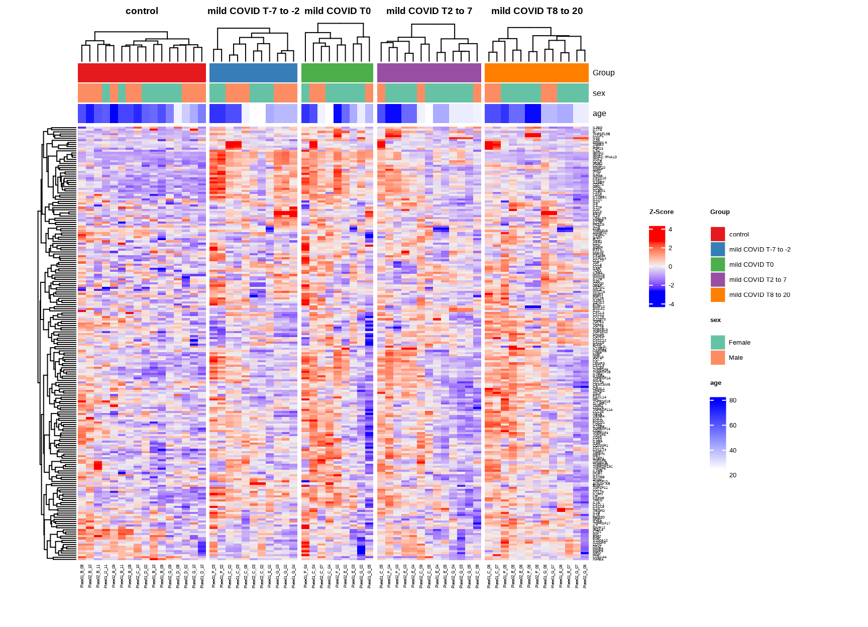
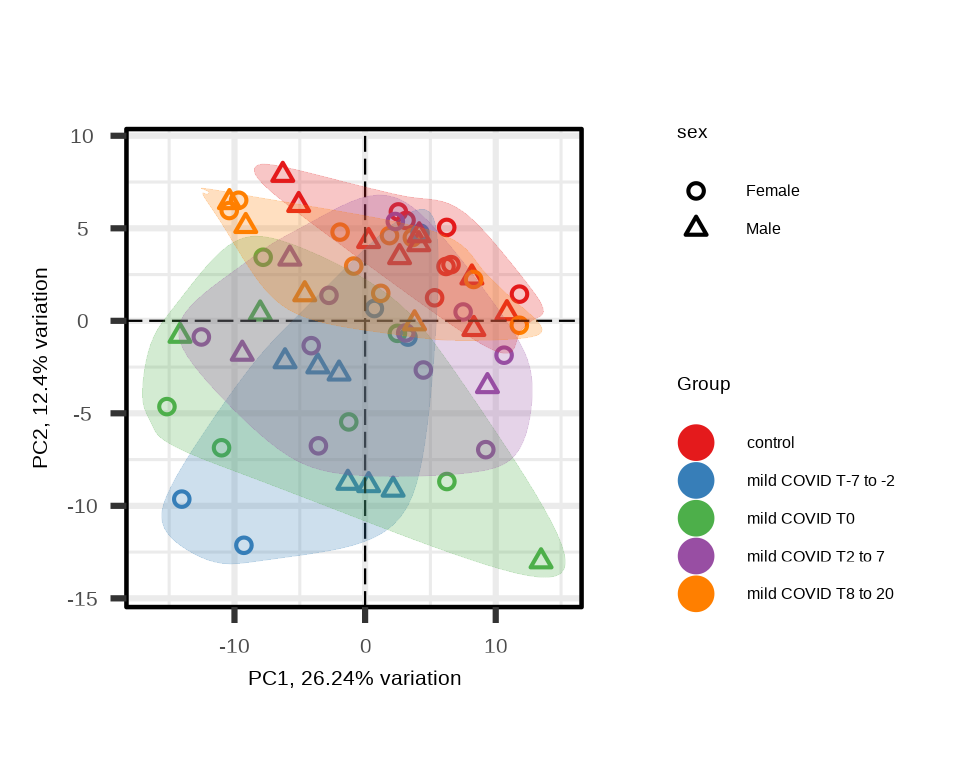
5.1.5 Exploratory Visualization
Before statistical analysis, visualize the data to understand overall patterns.
5.2 Linear Mixed-Effects Model
5.2.1 Group Effect Analysis
Test whether protein levels differ across time groups (COVID timepoints vs controls), adjusting for covariates and accounting for repeated measurements within patients.
5.2.2 Understanding the Model
The model components:
- Fixed effects:
Group + sex + age- Group: Primary variable of interest (controls and mild COVID time groups)
- sex + age: Covariates to adjust for
- Random effects:
(1|patientID)- Accounts for patient-specific baseline levels
- Models correlation within subjects
- Reduced model:
sex + age- Used for likelihood ratio test (LRT) to assess Group effect
The model fits: Protein Expression ~ Group + sex + age + (1|patientID)
The likelihood ratio test compares the full model against the reduced model to test whether the Group effect is significant.
5.2.3 Model Results
The function returns a list with two main components:
#> [1] "modelStats" "LRTstats"5.2.4 LRT Statistics
The LRTstats table contains results from the likelihood ratio test:
#> Preview of `lmerTest$LRTstats` Results Table (rounded to 3 digits):Key columns:
target: Target nameChisq_stat: Chi-squared statistic from LRTChisq_test_pval: Raw p-valueChisq_test_pval_FDR: FDR-adjusted p-valueChisq_test_pval_bonf: Bonferroni-adjusted p-value
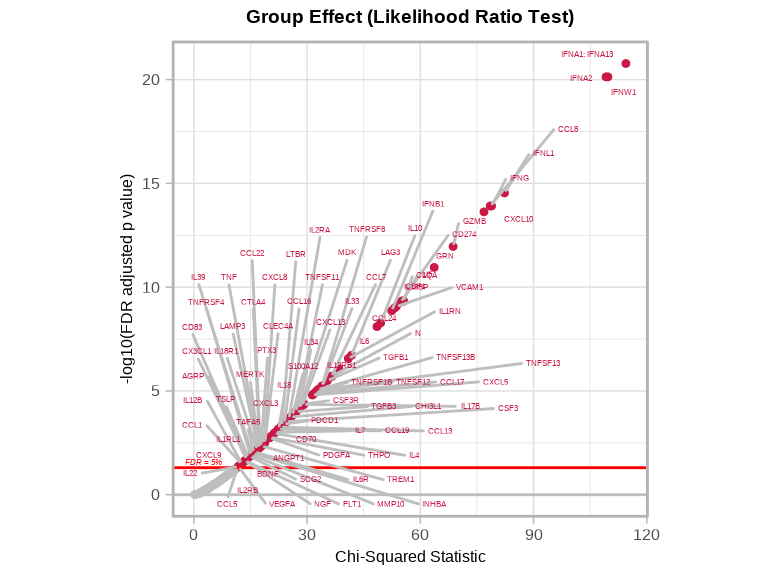
Interpretation:
- Chi-squared statistic: Measures overall Group Effect
- Larger values: Stronger evidence for group differences
- FDR < 0.05: Significant Group effect (at least one mild COVID timepoint group differs from control)
5.2.5 Model Coefficients
The modelStats table contains coefficient estimates for each Group comparison:
#>
#> Preview of `lmerTest$modelStats` Results Table (rounded to 3 digits):
For each comparison (e.g., “Groupmild.COVID.T0” vs reference “control”):
target: Target nameGroupmild.COVID.T0_coef: Effect size (difference from control)Groupmild.COVID.T0_pval: Raw p-valueGroupmild.COVID.T0_pval_FDR: FDR-adjusted p-valueGroupmild.COVID.T0_pval_bonf: Bonferroni-adjusted p-value
5.2.6 Overall Group Effect
Identify proteins with significant Group effect using LRT:
# Define significance threshold
fdr_threshold <- 0.05
# Find proteins with significant Group effect
sig_targets_covid <- lmerTest$LRTstats %>%
filter(Chisq_test_pval_FDR < fdr_threshold) %>%
arrange(Chisq_test_pval_FDR) %>%
pull(target)
cat("Significant proteins (Group effect):", length(sig_targets_covid), "\n")#> Significant proteins (Group effect): 895.2.7 Specific Time Comparisons
Examine which time points drive the Group effect:
# Significant at each timepoint vs control
timepoints <- c("T.7.to..2", "T0", "T2.to.7", "T8.to.20")
for (tp in timepoints) {
coef_col <- paste0("Groupmild.COVID.", tp, "_coef")
pval_col <- paste0("Groupmild.COVID.", tp, "_pval_FDR")
if (coef_col %in% colnames(lmerTest$modelStats)) {
n_sig <- sum(lmerTest$modelStats[[pval_col]] < fdr_threshold, na.rm = TRUE)
cat("mild COVID", gsub("\\.", " ", tp), "vs control:", n_sig, "significant proteins\n")
}
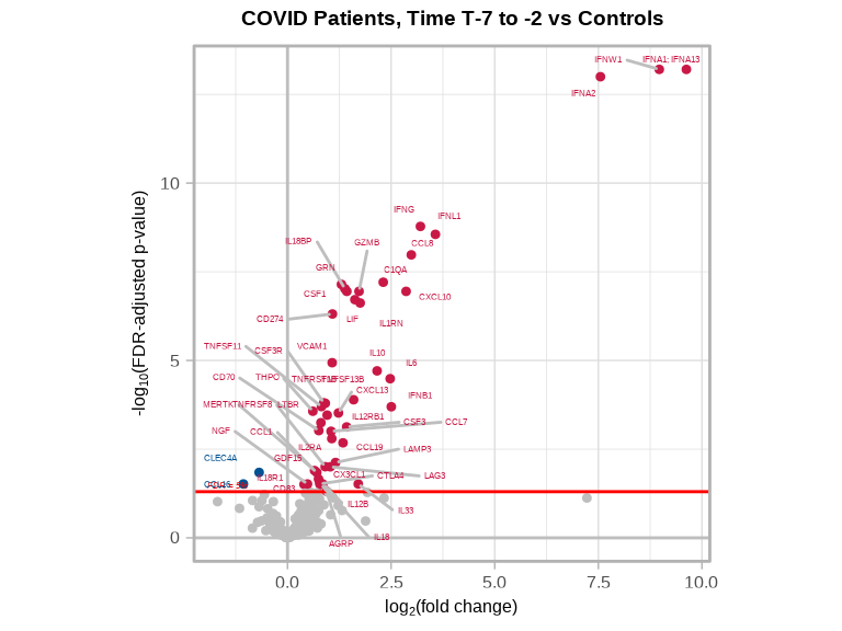
}#> mild COVID T 7 to 2 vs control: 49 significant proteins
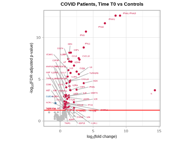
#> mild COVID T0 vs control: 64 significant proteins
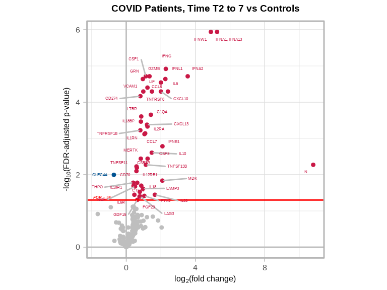
#> mild COVID T2 to 7 vs control: 47 significant proteins
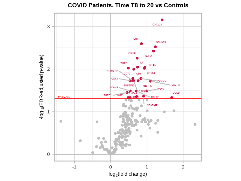
#> mild COVID T8 to 20 vs control: 27 significant proteins5.3 Volcano Plots
Visualize the statistical results for the overall Group effect and specific time comparisons.
5.3.1 Overall Group Effect (LRT)
volcanoPlot(
coefs = lmerTest$LRTstats$Chisq_stat,
p_vals = lmerTest$LRTstats$Chisq_test_pval_FDR,
target_labels = lmerTest$LRTstats$target,
title = "Group Effect (Likelihood Ratio Test)",
xlabel = "Chi-Squared Statistic",
ylabel = "-log10(FDR adjusted p value)"
)
5.3.2 Group-Specific Comparisons
Create volcano plots for each COVID timepoint vs control:
# T-7 to -2 vs Control
volcanoPlot(
coefs = lmerTest$modelStats$Groupmild.COVID.T.7.to..2_coef,
p_vals = lmerTest$modelStats$Groupmild.COVID.T.7.to..2_pval_FDR,
target_labels = lmerTest$modelStats$target,
title = "COVID Patients, Time T-7 to -2 vs Controls"
)
# T0 vs Control
volcanoPlot(
coefs = lmerTest$modelStats$Groupmild.COVID.T0_coef,
p_vals = lmerTest$modelStats$Groupmild.COVID.T0_pval_FDR,
target_labels = lmerTest$modelStats$target,
title = "COVID Patients, Time T0 vs Controls"
)
# T2 to 7 vs Control
volcanoPlot(
coefs = lmerTest$modelStats$Groupmild.COVID.T2.to.7_coef,
p_vals = lmerTest$modelStats$Groupmild.COVID.T2.to.7_pval_FDR,
target_labels = lmerTest$modelStats$target,
title = "COVID Patients, Time T2 to 7 vs Controls"
)
# T8 to 20 vs Control
volcanoPlot(
coefs = lmerTest$modelStats$Groupmild.COVID.T8.to.20_coef,
p_vals = lmerTest$modelStats$Groupmild.COVID.T8.to.20_pval_FDR,
target_labels = lmerTest$modelStats$target,
title = "COVID Patients, Time T8 to 20 vs Controls"
)
5.4 Trajectory Visualization
Visualize temporal patterns of significant proteins to understand how they change over time.
5.4.1 Spaghetti Plot: Discrete Time Groups
Show individual patient trajectories and group means across time groups:
# Prepare COVID patient data
covid_data <- data_covid %>%
filter(covid_status != "control",
Target %in% sig_targets_covid)
# Prepare control data
control_data <- data_covid %>%
filter(covid_status == "control",
Target %in% sig_targets_covid)
# Combine the data
combined_data <- bind_rows(covid_data, control_data)
# Calculate mean NPQ for COVID patients by Group
mean_trends <- combined_data %>%
filter(Group != "control") %>%
group_by(Target, Group) %>%
summarize(mean_NPQ = mean(NPQ, na.rm = TRUE), .groups = "drop")
# Calculate mean for controls
control_mean <- combined_data %>%
filter(Group == "control") %>%
group_by(Target, Group) %>%
summarize(mean_NPQ = mean(NPQ, na.rm = TRUE), .groups = "drop")
# Create the plot
ggplot() +
# Control points
geom_point(data = combined_data %>% filter(Group == "control"),
aes(x = Group, y = NPQ, shape = "Control", fill = "Control"),
color = "blue",
alpha = 0.5,
size = 1) +
# Individual patient trajectories (COVID only)
geom_line(data = combined_data %>% filter(Group != "control"),
aes(x = Group, y = NPQ, group = patientID, color = patientID),
alpha = 0.5,
linewidth = 0.5) +
geom_point(data = combined_data %>% filter(Group != "control"),
aes(x = Group, y = NPQ, color = patientID),
alpha = 0.7,
size = 1) +
# Mean trend line (COVID patients only)
geom_line(data = mean_trends,
aes(x = Group, y = mean_NPQ, group = 1),
color = "black",
linewidth = 1.2) +
geom_point(data = mean_trends,
aes(x = Group, y = mean_NPQ, shape = "Mean (COVID)", fill = "Mean (COVID)"),
color = "black",
size = 2.2) +
# Control mean
geom_point(data = control_mean,
aes(x = Group, y = mean_NPQ, shape = "Mean (Control)", fill = "Mean (Control)"),
color = "blue",
size = 2.2) +
# Manual scales for legend
scale_shape_manual(
name = "Group",
values = c("Control" = 17, "Mean (COVID)" = 18, "Mean (Control)" = 18),
breaks = c("Control", "Mean (Control)", "Mean (COVID)")
) +
scale_fill_manual(
name = "Group",
values = c("Control" = "blue", "Mean (COVID)" = "black", "Mean (Control)" = "blue"),
breaks = c("Control", "Mean (Control)", "Mean (COVID)")
) +
facet_wrap(~Target, scales = "free_y") +
labs(
title = "Significant Targets Over Time",
subtitle = "Targets with FDR-adjusted p < 0.05 for Group Effect from LRT",
x = "Group",
y = "NPQ",
color = "Patient ID"
) +
theme_minimal() +
theme(
axis.text.x = element_text(angle = 45, hjust = 1),
legend.position = "right",
plot.title = element_text(size = 14, face = "bold"),
plot.subtitle = element_text(size = 11)
) +
guides(
fill = guide_legend(order = 1, override.aes = list(alpha = 1)),
shape = guide_legend(order = 1),
color = guide_legend(order = 2, title = "Patient ID")
)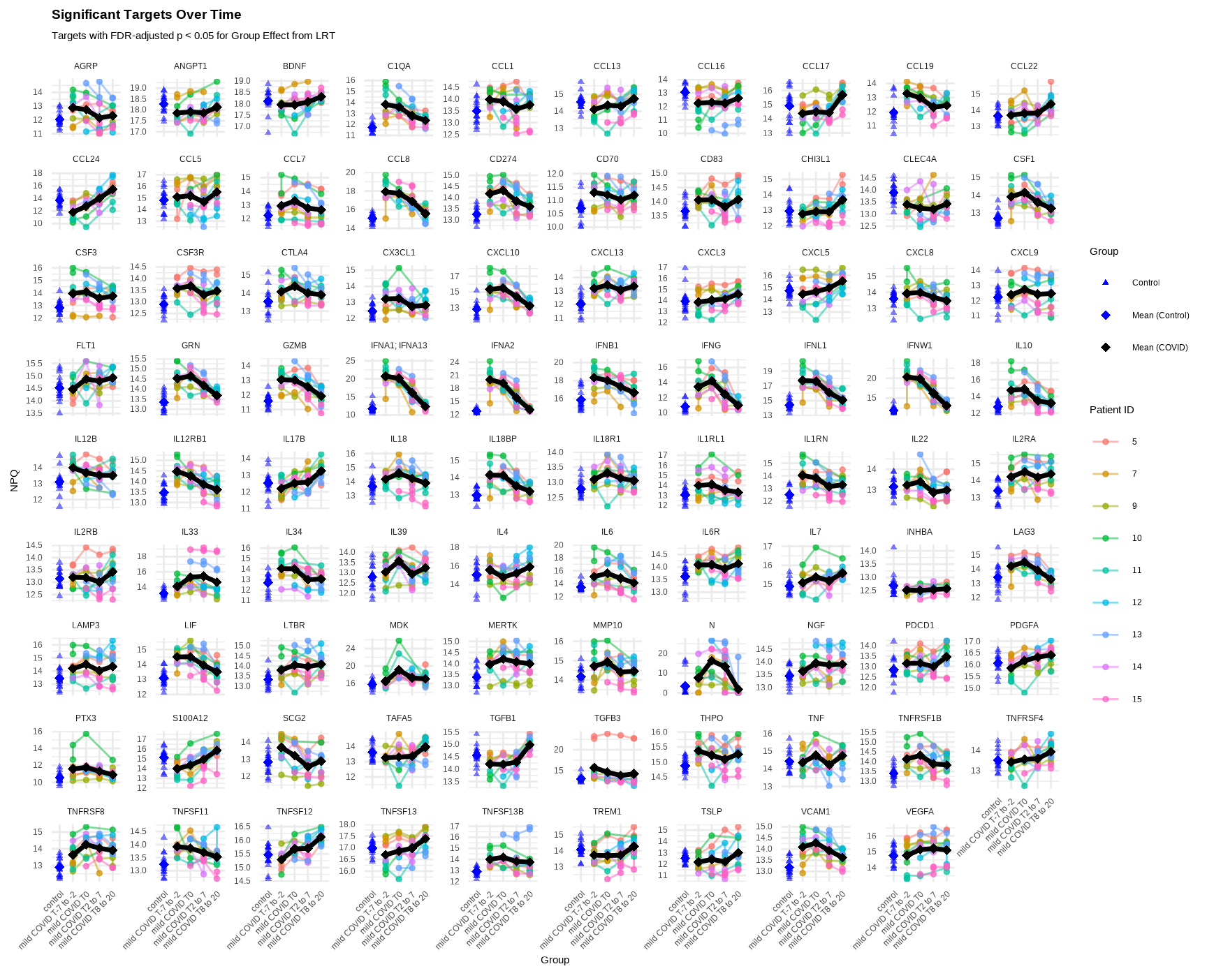
Interpretation:
- Individual lines: Each patient’s trajectory over time
- Black line: Mean trajectory for COVID patients
- Blue points: Control samples (single timepoint)
- Facets: Each panel shows a different significant protein
5.4.2 Spaghetti Plot: Continuous Time
Show trajectories using continuous time (days from peak N-protein):
# Prepare COVID patient data with continuous time
covid_data_cont <- data_covid %>%
filter(covid_status != "control",
Target %in% sig_targets_covid)
# Prepare control data - assign specific days_from_peak value
control_data_cont <- data_covid %>%
filter(covid_status == "control",
Target %in% sig_targets_covid) %>%
mutate(days_from_peak_N_protein = -14)
# Combine the data
combined_data_cont <- bind_rows(covid_data_cont, control_data_cont) %>%
mutate(is_control = ifelse(covid_status == "control", TRUE, FALSE))
# Calculate mean for controls
control_mean_cont <- combined_data_cont %>%
filter(is_control) %>%
group_by(Target, days_from_peak_N_protein) %>%
summarize(mean_NPQ = mean(NPQ, na.rm = TRUE), .groups = "drop")
# Create breaks and labels for x-axis
x_breaks <- c(-14, 0, 10, 20)
x_labels <- c("Control", "0", "10", "20")
# Create the plot
ggplot() +
# Control points
geom_point(data = combined_data_cont %>% filter(is_control),
aes(x = days_from_peak_N_protein, y = NPQ, shape = "Control", fill = "Control"),
color = "blue",
alpha = 0.5,
size = 1) +
# Individual patient trajectories (COVID only)
geom_line(data = combined_data_cont %>% filter(!is_control),
aes(x = days_from_peak_N_protein, y = NPQ, group = patientID, color = patientID),
alpha = 0.5,
linewidth = 0.5) +
geom_point(data = combined_data_cont %>% filter(!is_control),
aes(x = days_from_peak_N_protein, y = NPQ, color = patientID),
alpha = 0.7,
size = 1) +
# Smooth trend line (COVID patients only)
geom_smooth(data = combined_data_cont %>% filter(!is_control),
aes(x = days_from_peak_N_protein, y = NPQ, linetype = "Mean (COVID)"),
color = "black",
linewidth = 1,
se = TRUE,
method = "loess") +
# Control mean
geom_point(data = control_mean_cont,
aes(x = days_from_peak_N_protein, y = mean_NPQ, shape = "Mean (Control)", fill = "Mean (Control)"),
color = "blue",
size = 1.8) +
# Manual scales for legend
scale_shape_manual(
name = "Group",
values = c("Control" = 17, "Mean (Control)" = 18),
breaks = c("Control", "Mean (Control)")
) +
scale_fill_manual(
name = "Group",
values = c("Control" = "blue", "Mean (Control)" = "blue"),
breaks = c("Control", "Mean (Control)")
) +
scale_linetype_manual(
name = "Group",
values = c("Mean (COVID)" = "solid"),
breaks = c("Mean (COVID)")
) +
# Custom x-axis
scale_x_continuous(
breaks = x_breaks,
labels = x_labels
) +
# Add vertical line at day 0 (peak N protein)
geom_vline(xintercept = 0, linetype = "dashed", color = "gray50", alpha = 0.5) +
facet_wrap(~Target, scales = "free_y") +
labs(
title = "COVID Patients: Significant Targets Over Time",
subtitle = "Targets with FDR-adjusted p < 0.05 for Group Effect from LRT",
x = "Days from Peak N Protein",
y = "NPQ",
color = "Patient ID"
) +
theme_minimal() +
theme(
axis.text.x = element_text(angle = 45, hjust = 1),
legend.position = "right",
plot.title = element_text(size = 14, face = "bold"),
plot.subtitle = element_text(size = 11)
) +
guides(
fill = guide_legend(order = 1, override.aes = list(alpha = 1)),
shape = guide_legend(order = 1),
linetype = guide_legend(order = 1),
color = guide_legend(order = 2, title = "Patient ID")
)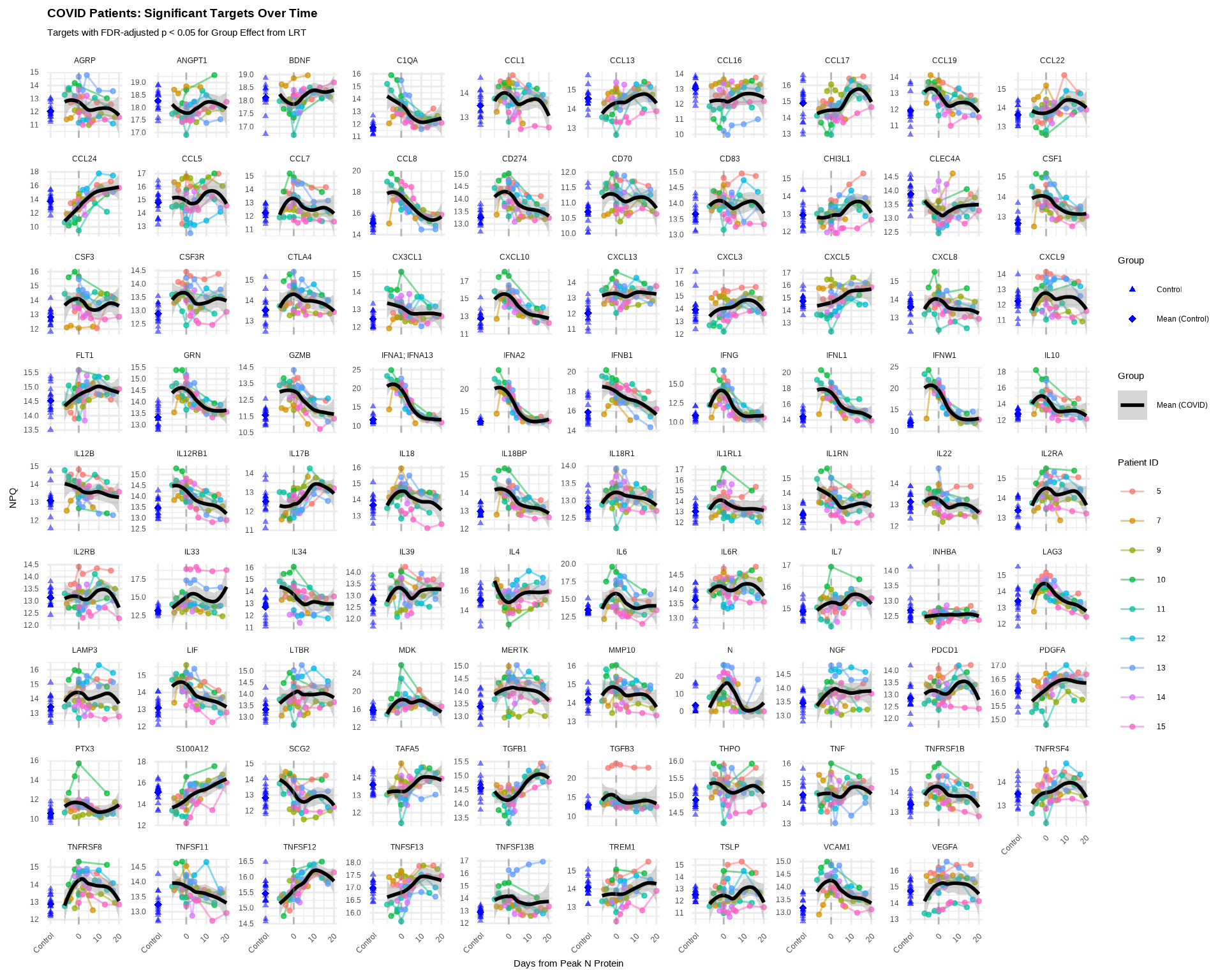
Interpretation:
- X-axis: Continuous time (days from peak N-protein expression)
- Shows more granular temporal patterns than discrete groups
5.5 Model Considerations
5.5.1 Random Effects Structure
The random effects structure determines how you model within-subject correlation:
# Random intercept only (baseline varies by subject)
modelFormula_random = "(1|patientID)"
# Random slope (time effect varies by subject)
modelFormula_random = "(1 + Time|patientID)"
# Nested random effects
modelFormula_random = "(1|clinic/patientID)"Guidelines:
- Use
(1|patientID)when subjects have different baselines but similar trajectories - Use
(1 + Time|patientID)when trajectories differ by subject (requires sufficient data per subject) - More complex random effects require larger sample sizes
5.5.2 Fixed Effects Design
# Group comparison (as used in example)
modelFormula_fixed = "Group + sex + age"
# Continuous time with interaction
modelFormula_fixed = "Time * covid_status + sex + age"
# Polynomial time trends
modelFormula_fixed = "poly(Time, 2) * covid_status + sex + age"For more information on linear mixed-effects models:
R documentation: ?lme4::lmer and ?lmerTest::lmer
5.6 Exporting Results
5.6.1 Save Results Tables
# Save LRT statistics
write_csv(lmerTest$LRTstats, "results/lmer_lrt_statistics.csv")
# Save model coefficients
write_csv(lmerTest$modelStats, "results/lmer_model_coefficients.csv")
# Save list of significant targets
sig_targets_df <- data.frame(
target = sig_targets_covid,
significant_group_effect = TRUE
)
write_csv(sig_targets_df, "results/significant_targets_covid.csv")5.6.2 Save Plots
# Save volcano plot for LRT
volcanoPlot(
coefs = lmerTest$LRTstats$Chisq_stat,
p_vals = lmerTest$LRTstats$Chisq_test_pval_FDR,
target_labels = lmerTest$LRTstats$target,
title = "Group Effect (LRT)",
xlabel = "Chi-Squared Statistic",
plot_name = "volcano_plot_lrt_group_effect.pdf",
data_dir = "figures",
plot_width = 6,
plot_height = 5
)
# Save time-specific volcano plots
timepoints_save <- list(
list(coef = "Groupmild.COVID.T0_coef",
pval = "Groupmild.COVID.T0_pval_FDR",
title = "T0 vs Control",
file = "volcano_T0_vs_control.pdf"),
list(coef = "Groupmild.COVID.T.7.to..2_coef",
pval = "Groupmild.COVID.T.7.to..2_pval_FDR",
title = "T-7 to -2 vs Control",
file = "volcano_T-7to-2_vs_control.pdf"),
list(coef = "Groupmild.COVID.T2.to.7_coef",
pval = "Groupmild.COVID.T2.to.7_pval_FDR",
title = "T2 to 7 vs Control",
file = "volcano_T2to7_vs_control.pdf"),
list(coef = "Groupmild.COVID.T8.to.20_coef",
pval = "Groupmild.COVID.T8.to.20_pval_FDR",
title = "T8 to 20 vs Control",
file = "volcano_T8to20_vs_control.pdf")
)
for (tp in timepoints_save) {
volcanoPlot(
coefs = lmerTest$modelStats[[tp$coef]],
p_vals = lmerTest$modelStats[[tp$pval]],
target_labels = lmerTest$modelStats$target,
title = tp$title,
plot_name = tp$file,
data_dir = "figures",
plot_width = 5,
plot_height = 4
)
}
# Save spaghetti plot
ggsave(
filename = "spaghetti_plot_significant_targets.pdf",
plot = last_plot(),
path = "figures",
width = 12,
height = 10,
device = "pdf"
)5.7 Complete Longitudinal Analysis Workflow
# Load libraries
library(NULISAseqR)
library(tidyverse)
library(table1)
# 1. Load and prepare data
data_covid <- read_csv(file.path(data_dir, "Alamar_NULISAseq_COVID_NPQ_data.csv"))
metadata_covid <- data_covid[, 1:9] %>%
select(-Panel) %>%
rename(SampleMatrix = SampleType) %>%
distinct() %>%
mutate(
covid_status = relevel(factor(covid_status), ref = "control"),
SampleMatrix = str_to_title(SampleMatrix),
sex = ifelse(sexF == 1, "Female", "Male"),
patientID = factor(patientID, levels = as.character(sort(as.numeric(unique(patientID))))),
Time = case_when(
covid_status == "control" ~ "control",
days_from_peak_N_protein == 0 ~ "T0",
days_from_peak_N_protein < -1 ~ "T-7 to -2",
days_from_peak_N_protein > 7 ~ "T8 to 20",
days_from_peak_N_protein >= 1 & days_from_peak_N_protein <= 7 ~ "T2 to 7"
),
Time = factor(Time, levels = c("control", "T-7 to -2", "T0", "T2 to 7", "T8 to 20")),
Group = case_when(
Time == "T0" ~ "mild COVID T0",
Time == "T-7 to -2" ~ "mild COVID T-7 to -2",
Time == "T2 to 7" ~ "mild COVID T2 to 7",
Time == "T8 to 20" ~ "mild COVID T8 to 20",
TRUE ~ "control"
),
Group = factor(Group, levels = c("control", "mild COVID T-7 to -2", "mild COVID T0",
"mild COVID T2 to 7", "mild COVID T8 to 20"))
) %>%
select(-sexF)
data_covid <- data_covid %>%
mutate(patientID = as.factor(patientID)) %>%
left_join(metadata_covid)
data_covid_wide <- data_covid %>%
select(SampleName, Target, NPQ) %>%
pivot_wider(names_from = SampleName, values_from = NPQ) %>%
column_to_rownames(var = "Target") %>%
as.matrix()
# 2. Create descriptive table
table1(~ SampleMatrix + age + sex + Time | covid_status, data = metadata_covid)
# 3. Generate exploratory visualizations
h_covid <- generate_heatmap(
data = data_covid_wide,
sampleInfo = metadata_covid,
sampleName_var = "SampleName",
annotate_sample_by = c("Group", "sex", "age"),
column_split_by = "Group",
output_dir = "figures",
plot_name = "heatmap_covid_all_samples.pdf",
plot_width = 10,
plot_height = 8
)
p_covid <- generate_pca(
data = data_covid_wide,
sampleInfo = metadata_covid,
sampleName_var = "SampleName",
annotate_sample_by = "Group",
shape_by = "sex",
output_dir = "figures",
plot_name = "pca_covid_all_samples.pdf",
plot_width = 7,
plot_height = 6
)
# 4. Fit linear mixed-effects model
lmerTest <- lmerNULISAseq(
  data = data_covid_wide,
  sampleInfo = metadata_covid,
  sampleName_var = "SampleName",
  modelFormula_fixed = "Group + sex + age",
  modelFormula_random = "(1|patientID)",
  reduced_modelFormula_fixed = "sex + age"
)
# 5. Identify significant proteins
sig_targets_covid <- lmerTest$LRTstats %>%
filter(Chisq_test_pval_FDR < 0.05) %>%
arrange(Chisq_test_pval_FDR) %>%
pull(target)
# 6. Create volcano plots
volcanoPlot(
coefs = lmerTest$LRTstats$Chisq_stat,
p_vals = lmerTest$LRTstats$Chisq_test_pval_FDR,
target_labels = lmerTest$LRTstats$target,
title = "Group Effect (LRT)",
xlabel = "Chi-Squared Statistic",
plot_name = "volcano_lrt_group_effect.pdf",
data_dir = "figures",
plot_width = 6,
plot_height = 5
)
## Timepoint-specific volcano plots
timepoints <- c("T.7.to..2", "T0", "T2.to.7", "T8.to.20")
for (tp in timepoints) {
coef_col <- paste0("Groupmild.COVID.", tp, "_coef")
pval_col <- paste0("Groupmild.COVID.", tp, "_pval_FDR")
volcanoPlot(
coefs = lmerTest$modelStats[[coef_col]],
p_vals = lmerTest$modelStats[[pval_col]],
target_labels = lmerTest$modelStats$target,
title = paste("COVID", gsub("\\.", " ", tp), "vs Control"),
plot_name = paste0("volcano_", tp, "_vs_control.pdf"),
data_dir = "figures",
plot_width = 5,
plot_height = 4
)
}
# 7. Create trajectory plots
## Categorical time spaghetti plot
## Prepare data for spaghetti plot
covid_data <- data_covid %>%
filter(covid_status != "control",
Target %in% sig_targets_covid)
control_data <- data_covid %>%
filter(covid_status == "control",
Target %in% sig_targets_covid)
combined_data <- bind_rows(covid_data, control_data)
mean_trends <- combined_data %>%
filter(Group != "control") %>%
group_by(Target, Group) %>%
summarize(mean_NPQ = mean(NPQ, na.rm = TRUE), .groups = "drop")
control_mean <- combined_data %>%
filter(Group == "control") %>%
group_by(Target, Group) %>%
summarize(mean_NPQ = mean(NPQ, na.rm = TRUE), .groups = "drop")
## Create and save spaghetti plot
spaghetti_plot <- ggplot() +
geom_point(data = combined_data %>% filter(Group == "control"),
aes(x = Group, y = NPQ, shape = "Control", fill = "Control"),
color = "blue", alpha = 0.5, size = 1) +
geom_line(data = combined_data %>% filter(Group != "control"),
aes(x = Group, y = NPQ, group = patientID, color = patientID),
alpha = 0.5, linewidth = 0.5) +
geom_point(data = combined_data %>% filter(Group != "control"),
aes(x = Group, y = NPQ, color = patientID),
alpha = 0.7, size = 1) +
geom_line(data = mean_trends,
aes(x = Group, y = mean_NPQ, group = 1),
color = "black", linewidth = 1.2) +
geom_point(data = mean_trends,
aes(x = Group, y = mean_NPQ, shape = "Mean (COVID)", fill = "Mean (COVID)"),
color = "black", size = 2.2) +
geom_point(data = control_mean,
aes(x = Group, y = mean_NPQ, shape = "Mean (Control)", fill = "Mean (Control)"),
color = "blue", size = 2.2) +
scale_shape_manual(
name = "Group",
values = c("Control" = 17, "Mean (COVID)" = 18, "Mean (Control)" = 18),
breaks = c("Control", "Mean (Control)", "Mean (COVID)")
) +
scale_fill_manual(
name = "Group",
values = c("Control" = "blue", "Mean (COVID)" = "black", "Mean (Control)" = "blue"),
breaks = c("Control", "Mean (Control)", "Mean (COVID)")
) +
facet_wrap(~Target, scales = "free_y") +
labs(
title = "Significant Targets Over Time",
subtitle = "Targets with FDR-adjusted p < 0.05 for Group Effect from LRT",
x = "Group", y = "NPQ", color = "Patient ID"
) +
theme_minimal() +
theme(
axis.text.x = element_text(angle = 45, hjust = 1),
legend.position = "right"
) +
guides(
fill = guide_legend(order = 1, override.aes = list(alpha = 1)),
shape = guide_legend(order = 1),
color = guide_legend(order = 2, title = "Patient ID")
)
ggsave(
filename = "spaghetti_plot_significant_targets.pdf",
plot = spaghetti_plot,
path = "figures",
width = 12,
height = 10
)
## Continuous time spaghetti plot
## Prepare data for spaghetti plot
covid_data_cont <- data_covid %>%
filter(covid_status != "control",
Target %in% sig_targets_covid)
control_data_cont <- data_covid %>%
filter(covid_status == "control",
Target %in% sig_targets_covid) %>%
mutate(days_from_peak_N_protein = -14)
combined_data_cont <- bind_rows(covid_data_cont, control_data_cont) %>%
mutate(is_control = ifelse(covid_status == "control", TRUE, FALSE))
## Calculate mean for controls
control_mean_cont <- combined_data_cont %>%
filter(is_control) %>%
group_by(Target, days_from_peak_N_protein) %>%
summarize(mean_NPQ = mean(NPQ, na.rm = TRUE), .groups = "drop")
## Create breaks and labels for x-axis
x_breaks <- c(-14, 0, 10, 20)
x_labels <- c("Control", "0", "10", "20")
## Create the plot
spaghetti_plot2 <- ggplot() +
# Control points
geom_point(data = combined_data_cont %>% filter(is_control),
aes(x = days_from_peak_N_protein, y = NPQ, shape = "Control", fill = "Control"),
color = "blue",
alpha = 0.5,
size = 1) +
# Individual patient trajectories (COVID only)
geom_line(data = combined_data_cont %>% filter(!is_control),
aes(x = days_from_peak_N_protein, y = NPQ, group = patientID, color = patientID),
alpha = 0.5,
linewidth = 0.5) +
geom_point(data = combined_data_cont %>% filter(!is_control),
aes(x = days_from_peak_N_protein, y = NPQ, color = patientID),
alpha = 0.7,
size = 1) +
# Smooth trend line (COVID patients only)
geom_smooth(data = combined_data_cont %>% filter(!is_control),
aes(x = days_from_peak_N_protein, y = NPQ, linetype = "Mean (COVID)"),
color = "black",
linewidth = 1,
se = TRUE,
method = "loess") +
# Control mean
geom_point(data = control_mean_cont,
aes(x = days_from_peak_N_protein, y = mean_NPQ, shape = "Mean (Control)", fill = "Mean (Control)"),
color = "blue",
size = 1.8) +
# Manual scales for legend
scale_shape_manual(
name = "Group",
values = c("Control" = 17, "Mean (Control)" = 18),
breaks = c("Control", "Mean (Control)")
) +
scale_fill_manual(
name = "Group",
values = c("Control" = "blue", "Mean (Control)" = "blue"),
breaks = c("Control", "Mean (Control)")
) +
scale_linetype_manual(
name = "Group",
values = c("Mean (COVID)" = "solid"),
breaks = c("Mean (COVID)")
) +
# Custom x-axis
scale_x_continuous(
breaks = x_breaks,
labels = x_labels
) +
# Add vertical line at day 0 (peak N protein)
geom_vline(xintercept = 0, linetype = "dashed", color = "gray50", alpha = 0.5) +
facet_wrap(~Target, scales = "free_y") +
labs(
title = "COVID Patients: Significant Targets Over Time",
subtitle = "Targets with FDR-adjusted p < 0.05 for Group Effect from LRT",
x = "Days from Peak N Protein",
y = "NPQ",
color = "Patient ID"
) +
theme_minimal() +
theme(
axis.text.x = element_text(angle = 45, hjust = 1),
legend.position = "right",
plot.title = element_text(size = 14, face = "bold"),
plot.subtitle = element_text(size = 11)
) +
guides(
fill = guide_legend(order = 1, override.aes = list(alpha = 1)),
shape = guide_legend(order = 1),
linetype = guide_legend(order = 1),
color = guide_legend(order = 2, title = "Patient ID")
)
ggsave(
filename = "spaghetti_plot_continuous_time_significant_targets.pdf",
plot = spaghetti_plot2,
path = "figures",
width = 12,
height = 10
)
# 8. Export results
write_csv(lmerTest$LRTstats, "results/lmer_lrt_statistics.csv")
write_csv(lmerTest$modelStats, "results/lmer_model_coefficients.csv")
write_csv(
data.frame(target = sig_targets_covid, significant = TRUE),
"results/significant_targets_list.csv"
)
# 9. Print summary
cat("\nLongitudinal Analysis Summary:\n")
cat("Total proteins tested:", nrow(lmerTest$LRTstats), "\n")
cat("Significant proteins (Group effect):", length(sig_targets_covid), "\n\n")
for (tp in timepoints) {
pval_col <- paste0("Groupmild.COVID.", tp, "_pval_FDR")
n_sig <- sum(lmerTest$modelStats[[pval_col]] < 0.05, na.rm = TRUE)
cat("Significant at", gsub("\\.", " ", tp), ":", n_sig, "proteins\n")
}5.8 Best Practices
Model Design
- Choose appropriate random effects structure based on your data
- Include relevant covariates (age, sex, batch, etc.)
- Ensure adequate sample size per subject for complex random effects
Assumptions
- Check for outliers and influential observations
- Verify normality of residuals (QQ plots)
- Assess homoscedasticity
Interpretation
- Use FDR-adjusted p-values to control false discovery rate
- Consider both statistical significance and biological relevance
- Visualize trajectories to understand temporal patterns
- Validate key findings with independent methods or cohorts
Reporting
- Document model formulas (fixed and random effects)
- Report sample sizes (subjects and observations)
- Describe significance thresholds
- Show both overall LRT results and specific contrasts
5.9 Common Issues
Problem: Model convergence failures
- Simplify random effects structure
- Center/scale continuous predictors
- Check for collinearity among predictors
- Increase iteration limits (see
?lmer)
Problem: No significant proteins
- Check if trajectories actually differ (visualize first)
- Sample size may be too small
- Effect sizes may be small
- Consider less stringent thresholds (exploratory only)
Problem: Too many significant proteins
- Check for batch effects or technical artifacts
- Verify model is appropriately specified
- Consider more stringent FDR threshold
Problem: Results don’t match trajectories
- Verify factor levels and reference groups
- Check that patientID is correctly coded
- Ensure metadata matches sample names
Continue to: Chapter 6: Outcome Modeling